Choosing a font that would be suitable for the subject of the website, easy to read, and in harmony with the overall style of the website – a rather complex process that requires careful thought.
Typography plays a key role in customer loyalty to the company, and also helps the user decide to order services or goods from the website.
A suitable font is selected according to several criteria, since even the best fonts for websites will only work if they are in tune with the particularities and specific features of the website.
When creating a website you need to think about a lot of things in advance. Make a layout, select images, write text. It often happens that working with text, you make mistakes when choosing the font.
Typography is a powerful way to communicate with users. The right font supports the idea and mood of the website, it is easy to read and perceive visually.
Sometimes a font can be a standalone visual element or work in tandem with an image. Below you will find a guide on how to choose fonts for the website.

Headings and main text
Fonts should complement, not conflict with the overall style of your website. Minimalistic, bright, classic, or trendy – regardless of the mood of the website, the fonts chosen are part of the overall visual experience.
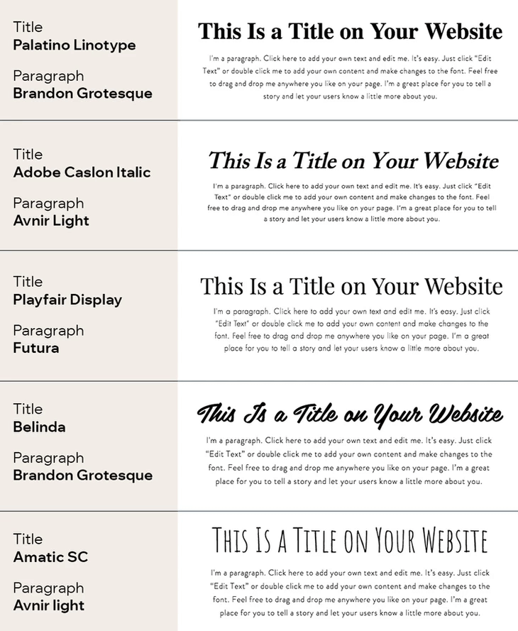
You need to choose 2 types of fonts for text content on the website: for the main text and headings. This is useful for reading articles, as visitors to the site immediately understand, where the main text, and where the headings are.
Also, such a division has a beneficial effect on website design. The overall style of the website becomes more holistic and structured.
If 2 types of fonts for the website are not enough, follow the simple rule: no more than 4 types of fonts on the page. For example, the title – Helvetica, the main text – Courier or Monaco.
Color soluti ons
The easiest and most effective solution is to use a color wheel. Color fonts should match the overall color scheme of the website.
Successful combinations of colors you can find on the Color Wheel from Adobe service. Selected combinations should still be tested (and, both among themselves and concerning the background of the website).
Rules for highlighting fonts
Color design – not the only way to properly, effectively, and harmoniously highlight the text. For this, there is a separate technique. For example, the general color of the text – white, and the allocation of important parts are done in black.
In this case, you need to maintain the contrast. The higher this indicator, the more effective the allocation will be. This determines the ease of perception of information.
This also applies to the background: the black text is much easier to read on a white background, and vice versa. Conversely, light gray letters are poorly viewed on a white background.
Size matters
You need to decide on a size. The size of the text on the website should not be less than 12px. Not too big, but at the same time readable.
If you choose a size of 16px, then it should be so on all pages, to keep the unity of style. Here are the best ranges for fonts of different purposes:
- Headings: 30-70 px
- Body text: 22-30 px
- Emphasis: 16-20 px
The size of the text is a key influence on how well the information is perceived. As you already understand, the font size for the text and headings should be different. At the same time, you need to keep the proportion between the main text and the headings.
Where to download popular fonts for websites?

When using fonts, pay attention to the licensing rules. Using stolen fonts on a website is fraught with legal liability. To avoid the hassle of purchasing licenses for websites, there are many fonts available for free online.
Services are filled with paid and free fonts, which are already widely used for commercial and non-commercial sites of various topics. For ease of search and perception fonts are divided into categories. This greatly simplifies the search for appropriate information and font design.
Conclusion
One of the important rules of effective web design is the choice of font. It has many parameters (type, size, color, serif or no serif, and so on). When selecting a font for the website, you need to keep in mind that the ultimate goal is a comfortable and convenient perception of the information by visitors of the website.
However, it should be understood that too simple design can harm the overall concept of appearance of the website, as well as the opposite – overloaded design can play a negative role in reading the text. We recommend harmoniously combining the key parameters of the font with the overall design concept of the website.


