Wix is a popular and one of the most user-friendly website builders currently in the market. Without any coding knowledge, enthusiasts who wish to create an online presence can easily do so with Wix.
The platform offers great templates which you can use as the base for your website.
After choosing a suitable template that most closely represents your dream site, you can start tweaking around with the powerful drag and drop page builder tool. This allows you to create some stunning websites.
Now as the saying goes – seeing is believing. So we don’t want you to simply take our words for it. Here we have put together a list of websites that have been built using Wix.
This should be able to give you a comprehensive idea of the sites you can create with the platform, and the professional appeal it brings with it.
Best Website Builders to Design Your Site
Wix Builder
- Drag and drop builder
- Custom domain
- Wix editor
- Ready templates
Bigcommerce
- eCommerce features
- Ready templates
- Complete hosted solution
- Modern design
Webador
- Ready website designs
- Use custom domain
- Create eCommerce site
- Optimize for Google
So without further ado, here are 50 Best Wix Site Examples:
Trendy Wix Site Design Examples
Wix is a popular and widely used website designing platform that can be used by any newbie to create attractive websites. The platform is easy and simple to use and it offers you all the modern features and options to help you create a beautiful and SEO optimized website.
We have collected some of the best sites created with Wix just for your inspiration.
Don’t Miss:
- Best Weebly Site Examples
- Best Squarespace Site Examples
- Best Divi Theme Site Examples
- Best BuddyPress Site Examples
Cricket Canada Kids
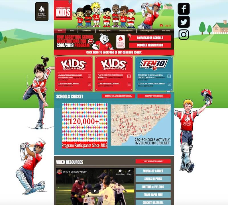
As the name suggests, this is a community site for Cricket lovers in Canada at the school level. Schools have the option to register and become a member to participate in different school level Cricket competitions.
The site looks very attractive. It is colorful which is expected as it is a site for school kids.
The overall design is quite attractive and engaging.
Olive Secret
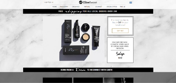
This is the official website of the popular sun care products provider Olive’secret. Their website is a great testament to how you can use Wix to incorporate an appealing banner into your website.
Linda Franzosi
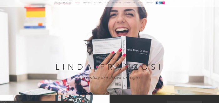
Linda Franzosi’s personal website is a great showcase of how you build your brand presence, and foretell clients all they need to know before hiring your service.
The site showcases the flexibility to meddle with backgrounds and the enhanced accessibility with other modules.
Jin Wu Koon
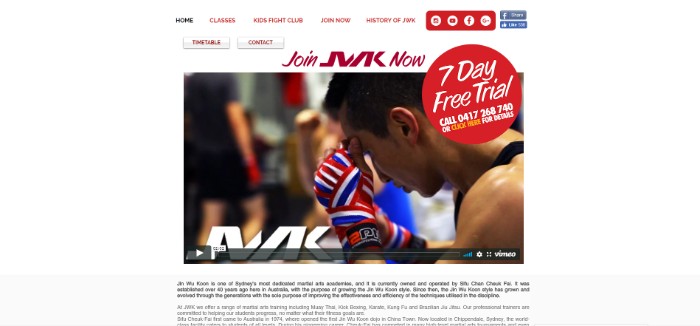
The man, Jin Wu Koon runs a martial arts business for which he takes help from this Wix-powered website to maintain an online presence. This is a minimal website that manages to include stunning promotional ads, social media integrations, and even a calendar.
Belly.be
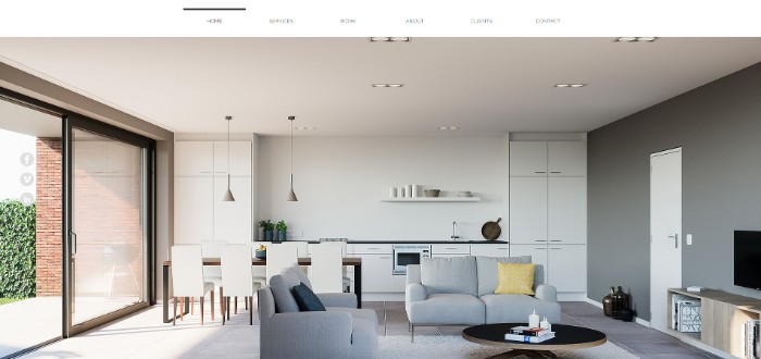
Belly.be is a 3D visualization studio. Naturally, their business requires having a website that manages to showcase their image-heavy designs in the most spectacular fashion possible.
This is something which they have fabulously achieved with the help of Wix and the clever full-width homepage slider.
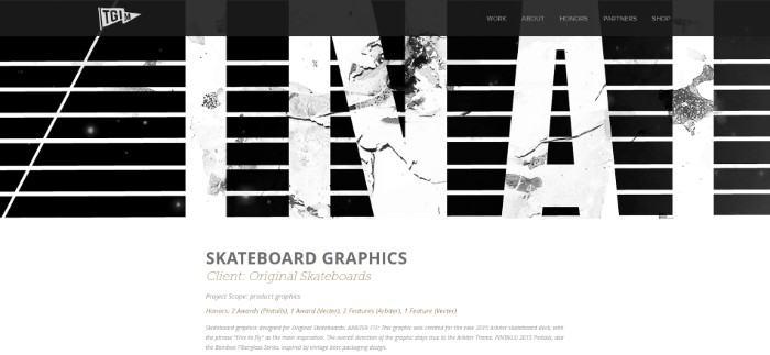
Thank God It’s Monday
The website’s biggest highlight would their portfolio page. Furthermore, the vertical slider on the homepage which conveniently allows users to browse through their site is also a nice edition. This just goes to show you – if you can think it, Wix can build it!
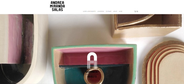
Andrea Miranda
Here we have an online jewelry store that has been carefully designed so that your eyes head on over to the content, which is actually where the money lies.
Besides this, there is also a conveniently introduced product page that offers easy navigation around the site, so that users can browse through all the apparel.
New Energy Colorado
As the name suggests, this site is about sustainable energy for the people living in Colorado. The site uses bright green colors and graphics to make it look attractive.
Crisp menu and attractive header section with graphics make the site look great. This site is created with Wix. Along with the information sections, it has a forum section, event section to engage the users.

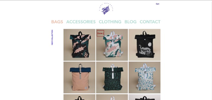
Stolen Goods
Now if you are looking for something so minimal that it is stripped down to the absolute basics, then here is a good example. The online clothing store boasts a design style that carries the customer right to your products and implements a clever call to action, so conversions are more likely to be made.
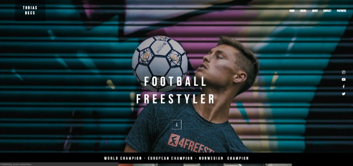
Tobias Becs
The site makes use of large images and videos to introduce us to the freestyle footballer – Tobias Becs.
You will also find all the relevant information necessary to get in touch with the person in the header. This is a unique example of a portfolio website.
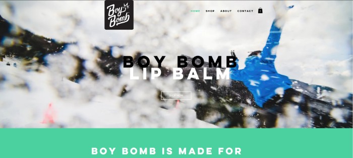
Good Feeling Goods
Yet another online store which is fully featured with all necessary options like a shopping cart, and so on. The homepage boasts a fantastic parallax display to gather the attention of its users.
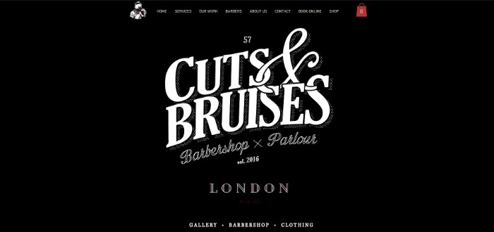
Cuts & Bruises
Next up, we have the official website of a chain of barbershops. Their websites use a hero image to give you a warm welcome, and then present all necessary information along with appropriately placed call-to-actions.
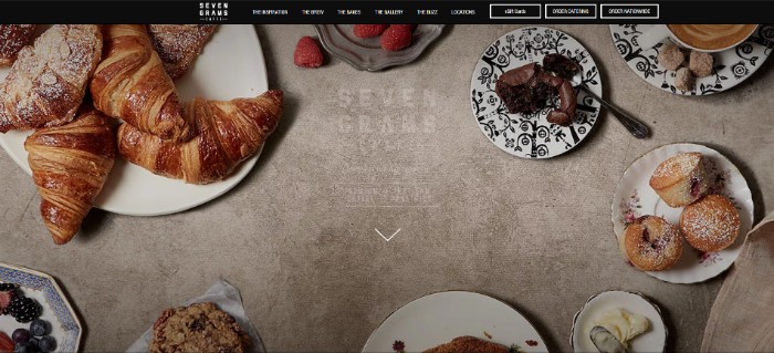
Seven Grams Caffe
And here we have a website that caters to a chain of cafes and restaurants – Seven Grams Caffe. The website boldly displays their USP across a magnificently built one-page website. Customers will find all the necessary information as they scroll down through the site.
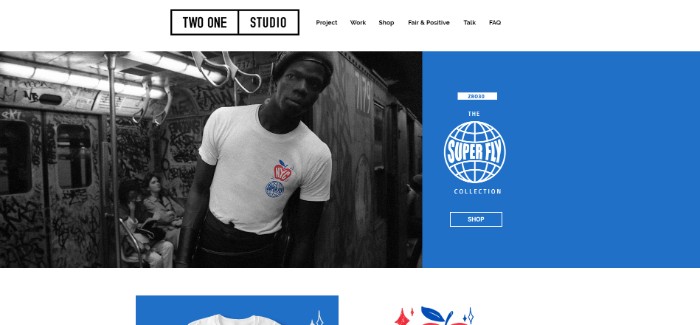
Two One
Currently, one of the biggest trends on the internet is to boast an asymmetric split-screen layout, which Two One studio fabulously accomplishes with Wix.
Besides aesthetic values, the site also manages to through in all necessary features customary with an online store.
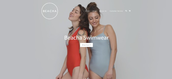
Beacha Swimwear
An online store for swimwear, the website built using Wix showcases how easily you can create a wonderful blend of colors, imagery, and parallax effect, to create a stunning and sleek website design.
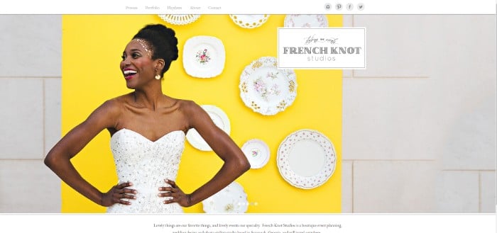
French Knot Studios
If you are planning to sell your business wedding photography skills, you ought to have a website that displays an essence of elegance that people expect of you. The website implements a simple design with a conveniently accessible portfolio page, and contact information – all that is necessary.
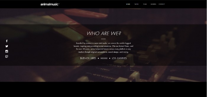
Animal Music
Animal Music represents an awesome portfolio website that implements extensive imagery coupled with videos to showcase the broad spectrum of work handled by professionals.
Sonja Van Duelmen
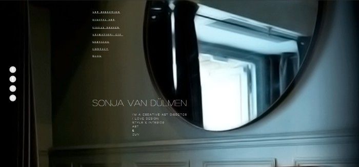
And now a portfolio website that perfectly boasts a bundle of items to showcase the variety of work done by the professional. The white borders help to divert the attention of visitors to her works specifically.
Samsikhk
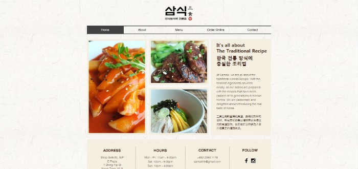
Here is another Wix-built restaurant website that uses a modular method to showcase imagery of their different foods. Furthermore, there is an online ordering functionality built into the site as well.
Brown Owl Creative
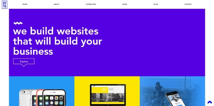
Even this website building service providers built their own website using Wix. This really goes to show you the appeal of Wix even amongst professionals.
Liam Rinat
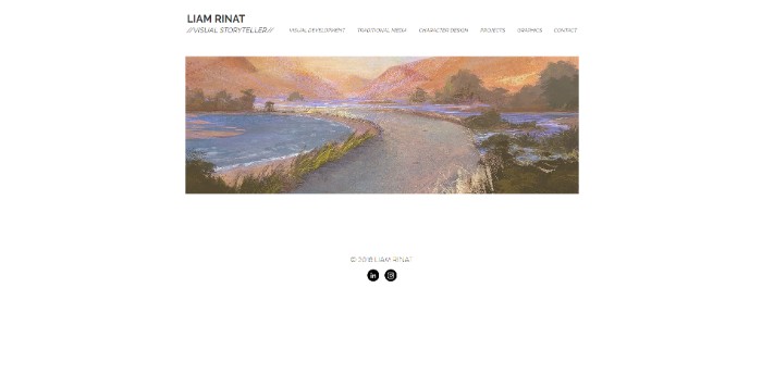
Liam Rant is a simple and clean website that also takes cues from Amber Schormans site – which we discussed earlier. This goes to show you, how much minimalism is in vogue with the professionals, and how easily a clean, minimal, and professional site can be built on Wix.
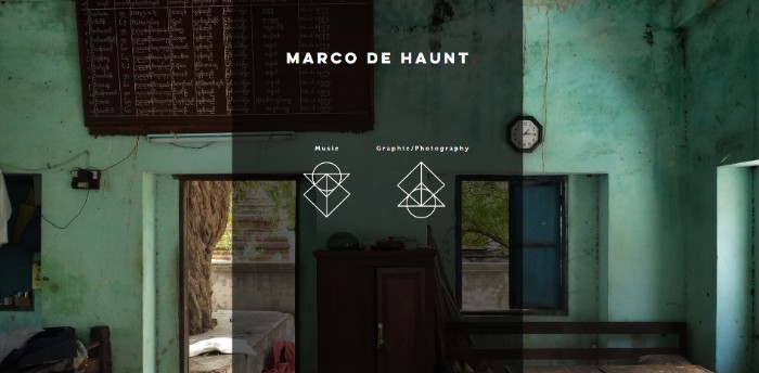
Marco De Haunt
Here is a website based on photography and music. The homepage boasts two clickable icons, clicking on which, will take you through a tour of everything within the website. This is an excellent example of artistry and the capability of Wix.
Jordy Likes Birds
A minimalistic-looking website boasting samples of illustrations, characters, and graphic designs related to children’s topics.

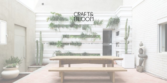
Craft and Bloom
And here we have a website which is essentially a minimalistic portfolio website boasting imagery of different work done by the interior designers.
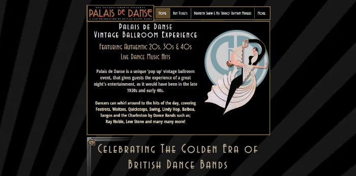
Palais De Danse
Palais De Danse provides interested customers with a vintage ballroom experience. To get an idea of their offering, the site is cleverly built with a vintage-like design and image sliders showcasing the experience in-store.
Yow Ogura
A portfolio website of a graphic designer, showcasing all her work in a clever and interesting fashion. The homepage is where you are offered two options to choose the language in which you wish to browse the website. After clicking on a particular language, you will be taken on a tour of the remaining portions of the site.

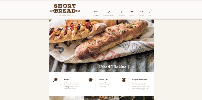
ShortBread
A website for a bakery where the homepage is essentially a long list of different dishes and other preparation. Then comes the header portion where you will be able to browse through other aspects of the site.
Soflo Candy and Cake
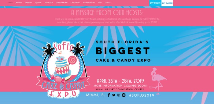
If you thought, or need to include a lot of testimonials, team members, achievements, or other aspects which highlight your business, then here is a site that will be of excellent inspiration.
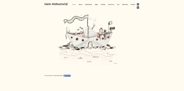
Lera Mishurav(a)
Yet another minimalist personal portfolio website that goes through different aspects of works of the respective artist.
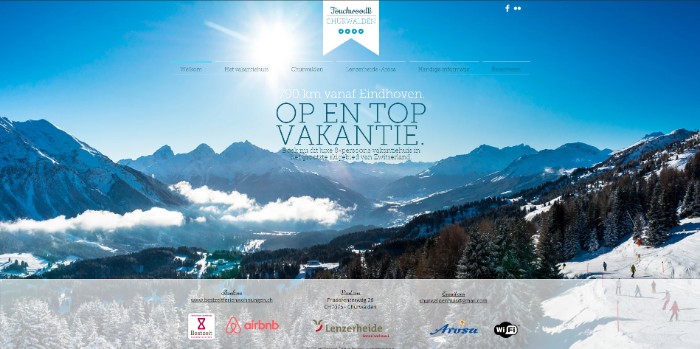
Churwalden
A website relating to tours and travels, Churwalden is an excellent source of inspiration. It shows you how to use Wix to prepare a site that is minimal on appeal but manages to put together everything necessary for interested clients.
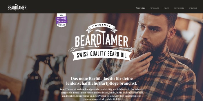
Beard Tamer
And we have another barbershop theme that boasts their brand with a bold and flamboyant home page, cleverly put together with parallax images and to keep users interested as they browse through all the offerings, products, and services.
Vanesa Longchamp
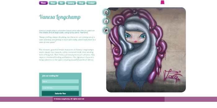
A portfolio website of an artist that is minimal, attractive, and efficient all in one. The homepage itself acts as a bio for the artist, and also boasts contact information from the get-go.
Ainoizumi
People looking forward to creating a website for their preschool/kindergarten can take reference from the cute website design that is boasted by Ainoizumi. Here they have put together different picture modules and wrapped them around a cloud design to create a unique design.

Takenaka
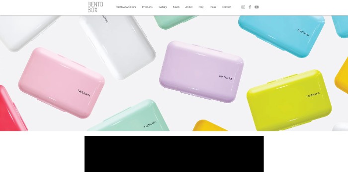
A website dedicated to a brand of Tupperware. Here you will get a scrollable line of images that showcases all the different products they have for sale. Just clicking them will take you off to the cart where you can make purchases.
Furhythm
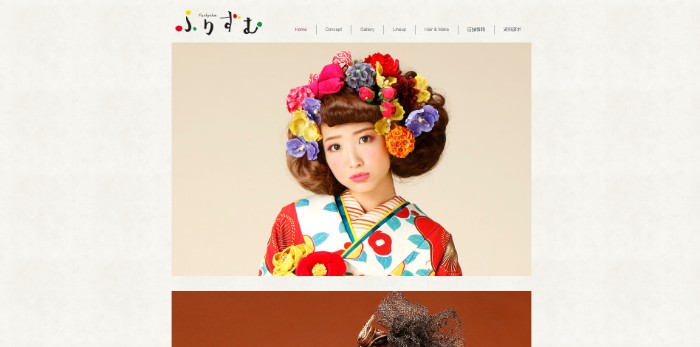
A website dedicated to Japanese makeup artistry, here too you will find a list of different images of models being. After you have seen the potential of how the makeup artist can modify your appearance, you can contact them to inquire about a quote.
Ladies of Lineage
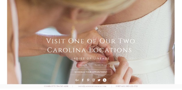
Ladies of Lineage is a bridal makeup service and here is their official website. The homepage boasts a welcome image that also lists the location of their studio and the option to schedule an appointment.
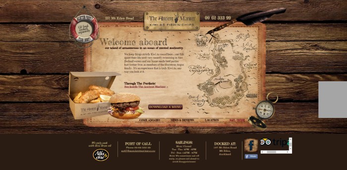
The Ancient Mariner
The website of a themed restaurant here is an example that showcases how you can create a wonderfully unique browsing experience for your client through Wix. With a clever tagline on the homepage, the menu is near the footer, and the footer itself consists of all related information about the restaurant.
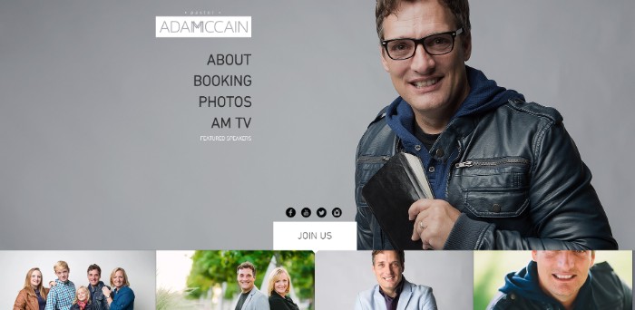
Adam McCain
This is a personal portfolio website of – Adam McCain. The moment you come to the site, you will be greeted with Adam McCain himself, and options to browse more ‘about’ the man, or see some of his works. Then as you scroll down, there are galleries and contact information.
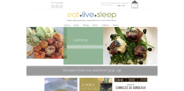
Eat Live Sleep
Eat Live Sleep is a website belonging to a line of restaurants. The site itself is a wonderful collage of images of their recipes and dishes. Then on the header, there are navigation options to other parts of the site.
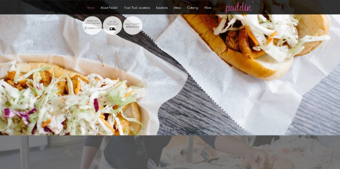
Puddin
Puddin is another website related to cooking and restaurant which uses their site coupled with an image slider to showcase their delicacies.
Brave
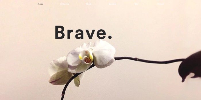
If you intend to create a community around a cause, then you can take cues from Brave, which is a website dedicated to creating a community around women empowerment. The site opens with a note for all the people visiting, it scrolls down to a message, and then finally comes down to a contact form.
Tougura
Yet another website related to cookery and restaurants. The landing page offers a bold image to hook the user so they start suffering the rest of the site through the navigation menu in the header, and other information which are showcased on the footer.

Asuka EO
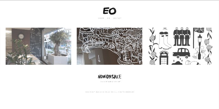
Up next, we have a website for a cafe. On the homepage, you will see the front of the store, along with other options that will take you deeper into the site.
Chilies Grill
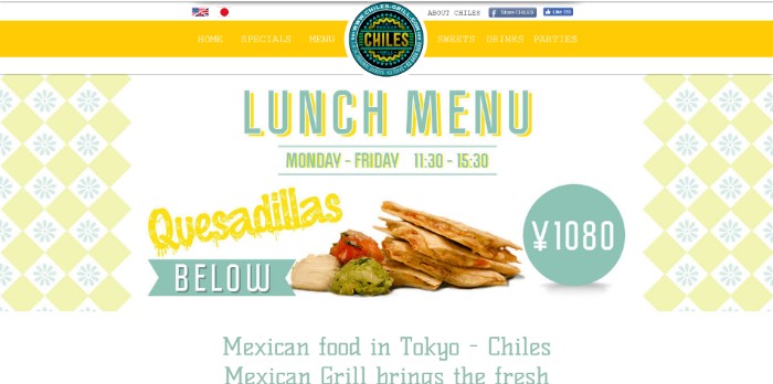
And now we have a website dedicated to a fast-food chain. Just arriving at the site you will be greeted to a ‘take out’ option to call the attention of the users, and then, as they scroll along, conveniently placed images of their food and information about their food are provided which increases the chances of conversion.
Le Petit
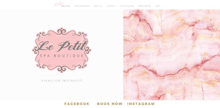
Here is the official website of a chain of Spa boutique. The landing page is a simple, minimal welcome message, with a navigation menu as a header that will take you around different parts of the site.
Conclusion:
As you can essentially see, with Wix you will be able to create almost any website pertaining to any niche. The platform delivers professional-grade results and will be a great tool to use on your next site-building project.
Also, in our search for the best Wix alternatives, we have tried to look for website builders that offer a similar or equivalent range of templates as well as modern, professional design options.
One of the top pick is Pixpa which is an all-in-one, DIY website builder platform designed to help photographers, creative professionals and businesses in building feature-rich, professional websites effortlessly, affordably and without touching a single line of code.
So, if you do decide to give Wix ago, then don’t forget to share with us how your site turned out! With your participation, this list will become even more comprehensive.


