Are you looking for the best Google Fonts that you can use on your blog? We have listed the top fonts in this article.
If you are using WordPress for your blog, you might like to have a look at the top Google Font WordPress plugins that you can use.
Creating a website where for publish your content, and throw yourself open to the world might be exhilarating, and quite overwhelming at the same time.
In a time where the global network is flooded with similar content and services, making yours distinctive and instantly eye-catchy is imperative.
For this, it is also important to understand how important literary advertising is. Therefore, we bring to you a wide array of Google fonts for websites that will make your headlines pop and attract the traffic your content deserves.
Having launched in 2010, Google fonts steadily received acclaim as they were extensively used professionally and personally. When you’re putting your ideas and content out there, its readability is of utmost importance.
Elaborate fonts might look nice on paper but might not get your message across because they’re not easily understood instantaneously.
You need something that will stick in the minds of your viewers by a mere glance. Here, we’ve put together a comprehensive list of Google fonts that will help your blog or website catch more eyeballs.
Also, it’s high time we break the Times New Roman monotony and induce some zeal while also maintaining our credibility!
Open Sans
One of the most popular and widely used Google Fonts, Open Sans is a sans serif typeface designed by Steve Matteson.
The simple and clean design of the Open Sans font makes it a popular choice among bloggers and writers. Even Google uses Open Sans fonts for the number of its pages.
- Optimized for prints
- Perfect for mobile devices
- Popular among bloggers
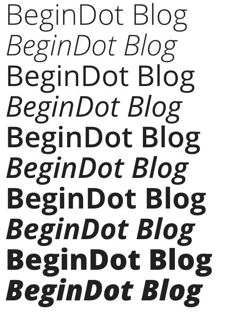
Lato
Lato is another commonly used open-source typeface. Originally designed as a corporate typeface, this Serif font was designed in 2010.
- Open for public
- Different versions available
- A Good option for blogs
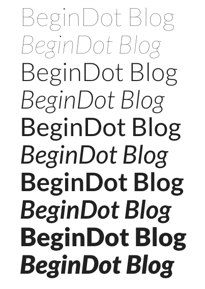
Vollkorn Font
This font revels in its subtlety. It is very modest and proportionate, making it soothing for the human eye. It is compatible with all sixes and also when it is emboldened or italicised.
This is important because it allows you to moderate your headlines as per you please, without having to bother about how it might look.
- Has 8 styles
- Can be used for small font sizes as well
- Meaty and dark lettering
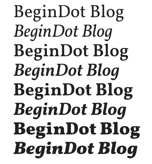
Bree Serif Font
The Bree Serif is soft around the edges giving it an elegant yet sophisticated allure. It is quite the right font if you want to highlight certain keywords or draw attention to specific phrases or sentences.
It is widely preferred for headlines or sub-headings as it makes the sentences pop out.
- Strictly upright
- Most popular in the US
- Garnered immediate preference after being released in 2008

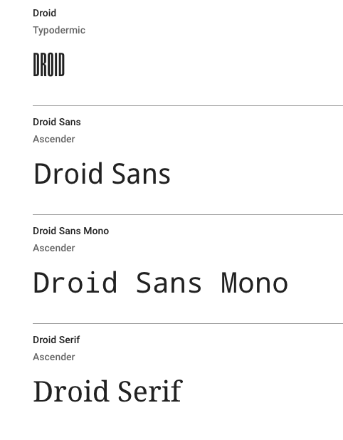
Droid Font
The Droid fraternity consists of Droid Sans, Droid Serif and Sans Mono and is equally compatible with all types of content in terms of paragraphs, headings, sub-headings or catchphrases.
These are thin and sharp, however once boldened, they fill up the spaces nicely to catch your attention. It can be used in the place of Microsoft Word’s Georgia or Verdana.
- Spread over three categories
- Versatile with several options
- An eye-catcher
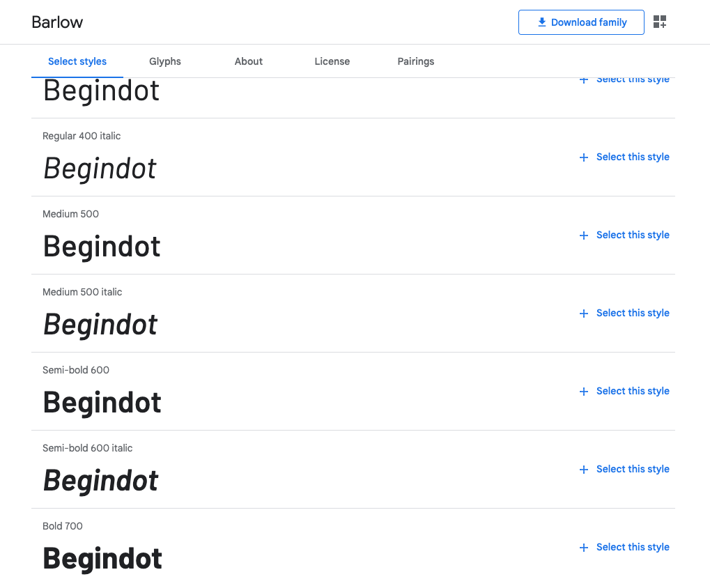
Barlow Font
Barlow is another top-quality free Google Font that you can use on your website, as well as any other project. This font looks crisp, good for readers. We have been using this font on our sister site and it looks great.
We use this font for the titles and headings. This font comes in a number of different versions, it comes in bold, semi bold, condensed versions. So, you have the variety you need for your project.
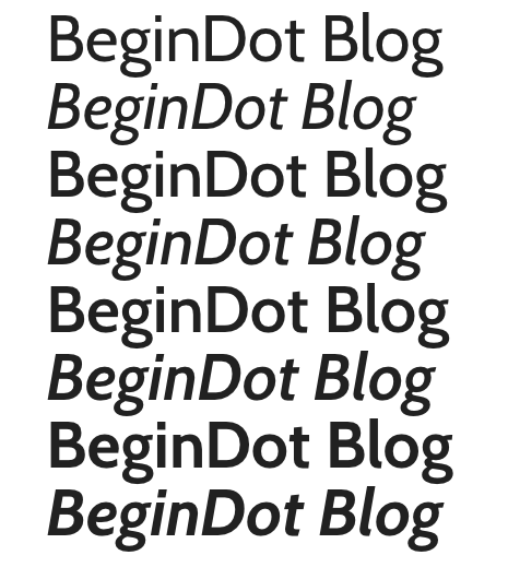
Cabin Font
This font can blend with any setting or background and will offer the same sense of clarity and legibility.
Increasing or decreasing its size will not forego its readability, hence giving you more creative liberty to explore your ideas and put them forth effectively.
The cabin is also sharp and precise, giving a formal outlook if your website or blog panders to a business set-up or a corporate audience, or those who have very little tolerance for fanciful writing.
- Monotone weight distribution
- Sharp and precise lettering
- Optically adjusted curves
Lobster Font
As quirky as the name goes, the font presents itself as italicised by default. It is also naturally bolded, and emboldening it further in addition to the italics is sure to garner some interest or attention.
It is very similar to cursive lettering where the letters are co-joined to one another, barely having gaps.
- Bold and italicised by default
- Thick cursive interface
- Ideal for headings

Goudy Bookletter 1911
For those of you loving classic text or are yearning to give an old-text feel for your website-Goudy is an ideal fit.
Its outlook does not compromise on its readability and the stout yet stiff wording of your content exudes a hint of anciency to your blog.
It is suitable across themes, sentences, and text body.
- A classical choice that you cannot go wrong with
- Beautifully engraved yet seemingly professional
- Regularly used in Canada and US

News Cycle Font
This font almost resembles the text in an old and forgotten English newspaper.
Its simplicity is palpable and is slim and condensed, unlike Goudy Bookletter. However, its slim frame does not make it congested or crowded, thus making it suitable for long paragraphs as well as headlines and subheadings.
- Resembles the 1980s era News Gothic
- Enhanced clarity and readability
- Slim and proportionate farmers
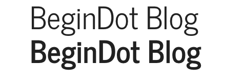
Allan Font
Allan is purely for the sake of fun and entertainment, with its decorative typeface looking like brushstrokes made from a really thin brush.
As Allan is ornate and italic, it might not be a suitable choice for the textual body but might seem great for as a headline or for a sentence that you want your viewers to spot.
- Better suited for large size
- Clear display and visibility
- Has been featured in over 60,000 web pages
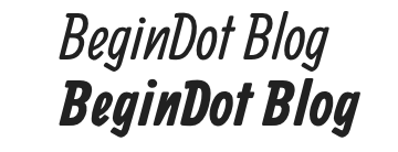
Lekton Font
The font Lekton looks like the aged writing on a yellowed telegraph. Its lettering is similar to that of a typewriter and the words are spaced with distinctive gaps between each other.
The words are slender and precise. It can be used beautifully if you want to put abstract phrases, poetry or text in vertical columns.
- Slender and telegraphic
- Hs trispaced glyphs
- Works well when emboldened

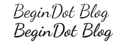
Dancing Script Font
If a sophisticated fairy tale had to be written, this is the font that would be used.
Although comical in its appeal, this italicised yet cursive font works best for informal headings or catchy captions lined across your homepage. Its usage in larger font sizes ranging from 18 to 32 is recommended.
- Quirky and purely fun-based
- Slender cursive wording
- Sports a friendly and spontaneously look
Mouse Memoirs Font
This font too is informal and borrows heavily from the well-known Mickey Mouse, hence you cannot entirely blame its comical outlook.
The gaps between the letters are not meant to be uniform and hence, are sparsely scattered. It is a classical fun font and can be used in accordance with your content and target audience.
- Singular style
- Inspired by vintage icons of pop culture
- Suitable for a young target audience

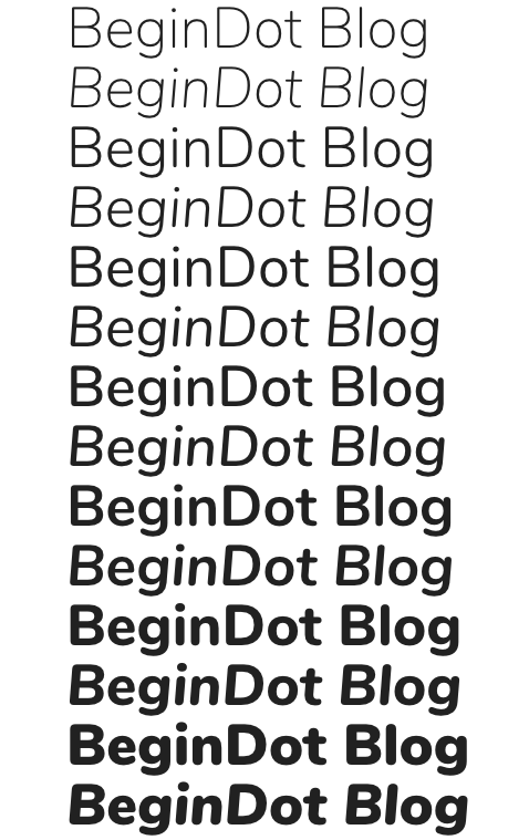
Nunito Font
The epitome of professional writing- Nunito is crisp as well as clear while also having a bold edge. It works to please across sizes, and bolding and italics attributes undeterred by what the background is.
Although perfect for headings, it can make a passable option for body text and also singularly phrased captions.
- Boasts 14 styles
- Proportionally balanced in terms of strokes and curves
- Aimed at display typography
Molengo Font
Although similar to Nunito, Molengo was designed exclusively for documents and textbooks with an ancient charm. With adequately placed letters and can be used leisurely for either body or headings.
- Vintage text with a tinge of modernity
- Complex yet functional
- Well-spaced alphabets

Alegreya Font
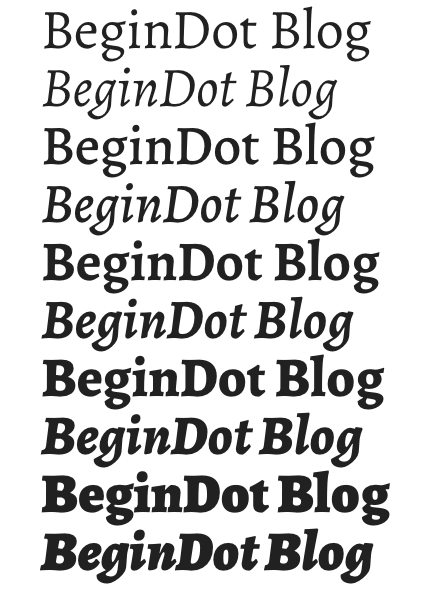
Mirroring the qualities of Bookman Old Style, Alegreya has variations of Alegreya Sans, Sans Medium, Sans SC and Black this font, in particular, is easy-going and nothing too elaborate or tedious for the reader, making it a perfect fit for longer and lengthier paragraphs.
Its ability to blend in is what sets it apart.
- Easy on the eyes
- A variety of four styles
- Uniform and business-like
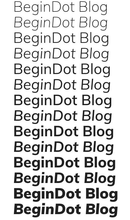
Muli Font
Depending upon whether you decide to italicise it or bolden it, Muli will complement your headings, your text, and body irrespective of the size you decide to use it in.
It is undoubtedly a safe choice if you’re looking for some stable and uniform premise for your content.
- Preferred for headings
- Works well with small and large sizes
- Predominant usage in US
Get the font
IBM Plex Sans Font
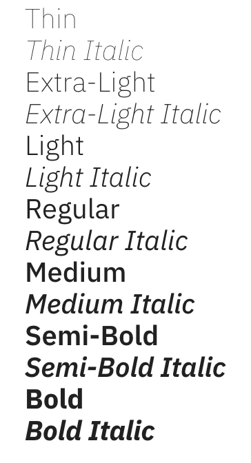
By far the one with the most variations, consisting of- Plex Mono thin, extra light, Sans Regular, Serif Regular, Serif Semi Bold and Mono Semibold.
With its wide variety of choices, you do not have to individually tailor your italics and bolded letters, you can just use the pre-existing variations of this font and see what suits them best.
- Impressive 6 styles
- Default italics and bold in specific styles
- Sophisticated
BioRhyme Font
BioRhyme is a free-flowing font that is unrestricted by the sharpness or crudeness of the letters. It is elegant, thick and the big block lettering can be used in either light, regular or bold tones.
This can serve as a catchy heading piece while also befitting the body of the text when there are multiple paragraphs and lengthy sentences.
- Classic bold text
- Belongs to a Latin typeface family
- Has 5 styles

Grand Hotel Font
An extremely curvaceous and upright font, the Grand Hotel is straight in its text and the letters are conjoined as and cursive lettering would be.
This font is a statement piece and grows better as you increase its size, thus enhancing its readability. It’s a classic font with a touch of modern-day eccentricity.
- Unique and attractive
- Upright, slender and cursive
- Perfect for lifestyle blogs and posts
Offside Font
Offside is what you would call a perfect blend between a decorative yet simple structure. The fine strokes, shapely endings if the alphabets and barely visible gaps within letters are quite impressionable.
This would make for a great body with simple and precise paragraphs or a couple of sentences.
- Rectangular curved structure
- Exudes modern simplicity
- Perfect for signage

Monda Font
Monda revels in the simplicity of its structure and the subtle aura of attractiveness.
Although this might not be the first font of your eye-catches, it can surely be a go-to option for pages of content owing to its extremely readable characters.
- Freedom of usage across devices
- Hails from a free font family
- It has been spotted in over 1, 20, 000 websites

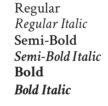
Crimson Text Font
Serif is what you call a slight projection at the end of the alphabet’s stroke, which is slightly curved to give a precise old-school look.
Crimson text is bedecked with serifs which makes it a convenient everyday font, owing to its clear-cut typeface and augmented legibility.
And because of this, it can serve well as headings and body text without being too harsh on the eyes.
- Has strong serifs
- Doesn’t appear monotonous or straining
- Has small caps and clear characters
Rambla Font
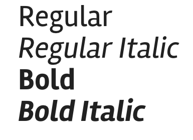
Rambla is what you get if you compress the Crimson text. Swift strokes with curved endings are this font’s specialty and work extremely well when the text is enlarged.
Its longer rather than broad, and would be a perfect fit for sub-headings or single- phrase captions.
- Has 4 styles or weights
- Bold but condensed
- Economical spacing and wording
Sanchez Font
Stocked with voluptuous typeface and curvaceous endings, the Sanchez font is widely preferred for large headings and sub-headings that you’d like to place on the top right corner to catch eyeballs.
Acutely spaced and bold lettering adorn its squared structure, which is why people have been convinced that it bears resemblance to the Rockwell font.
- Has a Chilean foundry origin
- Acute spacing
- Perfect for headings, body, and text

Roboto Font
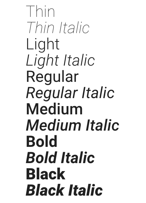
Google Roboto is unlike Microsoft Word’s Roboto. This font has been perfected especially for magazine-style writing and will also do well for your personal blogs.
It is diversified into six categories depending on the specific italicisation or emboldening that you prefer. It has proven to be efficient for body text.
- Widely preferred for all kinds of content
- Has a rigid but natural rhythm
- Vastly geometric letters
Playfair Display Font
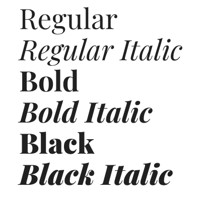
Short, crisp and precise lettering is what Playfair display is famous for and rightly so. This typeface is extremely professional and the business-like allure will bode well with your corporate content for a specific professional target audience.
Here, the capital letters are only slightly larger than the rest of the letters- it is well-suited for body text and headings likewise.
- Houses 6 styles
- Has a transitional design with delicate strokes
- Belongs to the small caps family
Montserrat Font
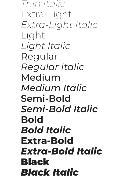
This is the perfect font if the content on your blog or website is inclined towards a creative side. If you’re publishing your literature, music or other art forms- Montserrat should be your go-to option.
It’s squared structure with evident curves and upright lettering borrows heavily from old-school posters and magazine headlines. There is also alternative capitalisation, making it a very functional font.
- Extensively functional and thus a popular choice
- Has discretionary ligatures
- Sister family of Alternates and Subrayada
Fjalla One Font
Characterized by its upright let slender lettering, this font is applicable for sub-headings and for text in speech bubbles or confined spaces like text boxes.
Works well when it’s bold and sized from 16-24. Also, don’t worry if you can’t pronounce this, we won’t hold it against you!
- Possesses a single style
- Medium contrast serif
- Versatile to be used across sizes

Rubik Font
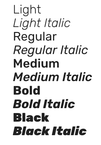
Consisting of a diversity of six weights, Rubik comes in various forms of bold, light, medium and black. This stocky font is bold by default and a great fix for center headings.
Its light or medium variations, however, can be used for full-body text with large paragraphs. It’s built-in such a way that its continuous reading will not strain the eye.
- Hails from the sans serif family
- It can transform from light to bold with the help of weights
- 10 styles
Raleway Font
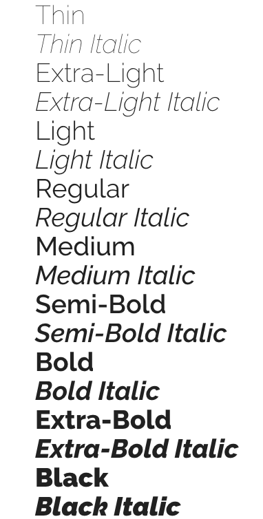
Light, feather-touch lettering with sharp edges, the Raleway is adaptable to any sizes, italics or bold variations.
In case you’re planning on adding thin headings or captions that are important but don’t require as much attention as the main headings, then this is a perfect choice.
- One of the highest styles, amounting of 18
- You are torn between ample choices
- Raleway Dots is the sister family
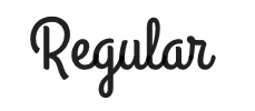
Cookie Font
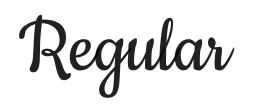
To finish off, this one is a fun font with thick strokes of cursive writing. It’s elegant curves and neat lines exude a dreamy yet well-styled look, almost mirroring calligraphy.
With its vintage tinge, this font is quite legible despite the numerous curves and can suit your headings as well as subheadings. However, it as an option for body text might seem repetitive and hard to continue reading.
- Elegant and ornate
- Can beautify home page headings and captions
- Decoratively cursive and slender
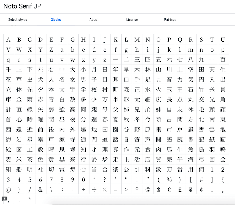
Noto Serif
Available in multiple languages, Noto Serif is one of the most popular Google fonts. You can use this font freely on any of your personal as well as commercial projects.
Noto Serif JP comes with Extra-Light, Light, Regular, Medium, Semi-Bold, Bold and Black styles making it suitable for any kind of project.
It can be a great font for your blog posts as well.
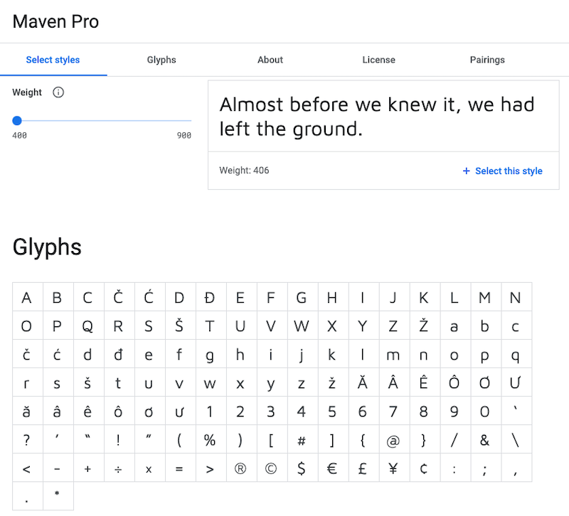
Maven Pro
Maven Pro is another sans-serif typeface that you can use as the regular font for your blog or any other project.
It comes with certain limitations such as it doesn’t offer Italics version of the font. Through it can be a great font for your headlines.
Final Word
These aforementioned fonts can prove to be quite powerful or impactful, if used correctly and with respect to your backdrops and website themes.
Psychological trials regarding fonts have documented how people react to certain fonts and thus, our precisely curated list will help you reach your target audience effectively.
Although the appeal is important, readability and legibility are in precedence because they determine if you have successfully conveyed your idea, opinion or message to your reader.
Therefore, although you want your website to be decorative or alluring, you might not want to be overly experimental.
Content creation is an art and one that we hope you perfect with a little help from us. Get started on your website and unfurl yourself to the world!
If you find the article helpful, don’t forget to share it with your friends.
Also Read:

