A collection of the best free jQuery CSS3 menu plugins that you can download and use on your project. These are ready-to-be-used menu plugins that will save a lot of your time.
Building a website can sometimes be a complex task. From the basic design to the navigation of your website, there are numerous things that need to be taken care of to build a perfect website that attracts and engages your visitors.
Out of the many important factors that need to be taken care of, the navigation of your website is one of the most important points to be kept in mind while building a website.
Navigation is like a web compass that needs to be included in a website to make the visitors explore your site.
A website without a proper navigational design is like a mess, and the visitors usually leave the website without knowing how to navigate through the information.
If you have ever visited a website without well-designed navigation, you’ll understand the hustle involved in finding the information that you need.
To make your website responsive and user-friendly, navigation tools are required. Your website’s navigation introduces your website and its pages to the visitors and helps them get the best of information on your website in a hassle-free manner.
With the evolution of the modern and responsive web, the number and availability of navigation tools have increased manifolds.
One such important tool is jQuery. With the help of jQuery, you can include highly user-friendly navigational menus to your website that will keep your users engaged and will help them in exploring your website.
Following is a list of jQuery navigation menu plugins that will give your website the necessary boost in terms of content exposure and help you make sure that your website is well navigated and none of your content remains unnoticed.
Before you proceed with this article, have a look at our collection of the best WordPress mega menu plugins that will help you to create a great-looking menu on your WordPress site.
Also Read:
Beautiful jQuery Navigation Menu Plugins
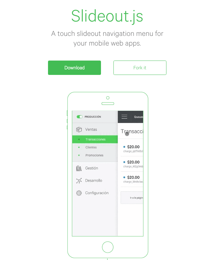
Slideout.Js
Slideout.Js is one of the most famous navigation menus and is light in weight. It is a dependency-free plugin for creating a touch slide navigation menu for web and mobile applications.
.ugb-16d90e0-wrapper.ugb-container__wrapper{padding-top:0 !important;padding-bottom:0 !important}.ugb-16d90e0-wrapper > .ugb-container__side{padding-top:35px !important;padding-bottom:35px !important}
.ugb-54aa967 .ugb-button1{background-color:#ff6900}.ugb-54aa967 .ugb-button1 .ugb-button–inner,.ugb-54aa967 .ugb-button1 svg:not(.ugb-custom-icon){color:#fefefe !important}
Full Screen Pushing Navigation
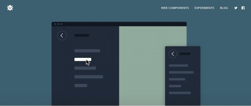
As the name suggests, this plugin comes with full-size navigation. It replaces the current content entirely when the menu is open and makes sure that the content in your menu is highlighted.
The Full Screen Pushing Navigation Plugin works well on mobile phones as well as desktops.
.ugb-e6b52b9-wrapper.ugb-container__wrapper{padding-top:0 !important;padding-bottom:0 !important}.ugb-e6b52b9-wrapper > .ugb-container__side{padding-top:35px !important;padding-bottom:35px !important}
.ugb-59b82ab .ugb-button1{background-color:#ff6900}.ugb-59b82ab .ugb-button1 .ugb-button–inner,.ugb-59b82ab .ugb-button1 svg:not(.ugb-custom-icon){color:#fefefe !important}
CSS3 Side Menu
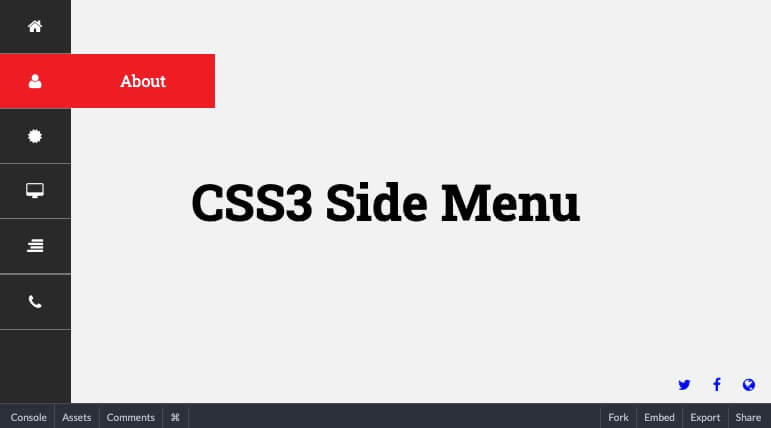
If you are managing a single-page site, this can be a great addition to your site. You can use this simple side menu on your one-page site to navigate to different sections of your site.
The menu comes with an attractive hover effect to make it look great on your site. You can customize it to make it blend with the color scheme of your site.
.ugb-4e627dc-wrapper.ugb-container__wrapper{padding-top:0 !important;padding-bottom:0 !important}.ugb-4e627dc-wrapper > .ugb-container__side{padding-top:35px !important;padding-bottom:35px !important}
.ugb-12630ff .ugb-button1{background-color:#ff6900}.ugb-12630ff .ugb-button1 .ugb-button–inner,.ugb-12630ff .ugb-button1 svg:not(.ugb-custom-icon){color:#fefefe !important}
Color-Coded Dropdown Navigation with Sub Menus
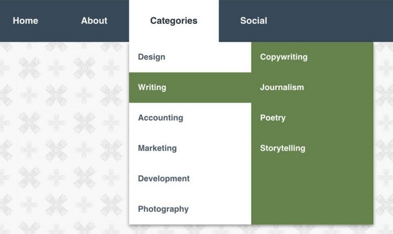
Drop-down menus are not the latest feature but they are best for the purpose they serve. The Color-Coded Dropdown Navigation with Sub Menus helps you in creating interactive menus on your website that support all browsers and operating systems.
.ugb-bde1633-wrapper.ugb-container__wrapper{padding-top:0 !important;padding-bottom:0 !important}.ugb-bde1633-wrapper > .ugb-container__side{padding-top:35px !important;padding-bottom:35px !important}
.ugb-c0c96da .ugb-button1{background-color:#ff6900}.ugb-c0c96da .ugb-button1 .ugb-button–inner,.ugb-c0c96da .ugb-button1 svg:not(.ugb-custom-icon){color:#fefefe !important}
Bouncy Navigation
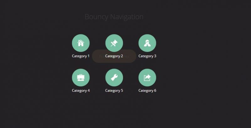
Bouncy Navigations uses CSS animations and jQuery to animate the navigation items. Whether it is modal navigation or a list of categories, all of it gets covered with this highly user-friendly plugin.
.ugb-aed432d-wrapper.ugb-container__wrapper{padding-top:0 !important;padding-bottom:0 !important}.ugb-aed432d-wrapper > .ugb-container__side{padding-top:35px !important;padding-bottom:35px !important}
.ugb-8b9d9d7 .ugb-button1{background-color:#ff6900}.ugb-8b9d9d7 .ugb-button1 .ugb-button–inner,.ugb-8b9d9d7 .ugb-button1 svg:not(.ugb-custom-icon){color:#fefefe !important}
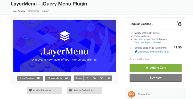
LayerMenu
A quick and fully responsive menu plugin to impress your clients with an amazing user experience. This menu plugin is coded with HTML5 & CSS3 code to make it lightweight.
A new modern design needs a new modern menu, and this plugin will be created just to make that possible. The plugin comes with amazing layered menu options.
You will have unlimited color options, unlimited menu layers, Font Awesome icons, beautiful CSS3 animations and a lot more.
.ugb-306da1a-wrapper.ugb-container__wrapper{padding-top:0 !important;padding-bottom:0 !important}.ugb-306da1a-wrapper > .ugb-container__side{padding-top:35px !important;padding-bottom:35px !important}
.ugb-10b08c5 .ugb-button1{background-color:#ff6900}.ugb-10b08c5 .ugb-button1 .ugb-button–inner,.ugb-10b08c5 .ugb-button1 svg:not(.ugb-custom-icon){color:#fefefe !important}
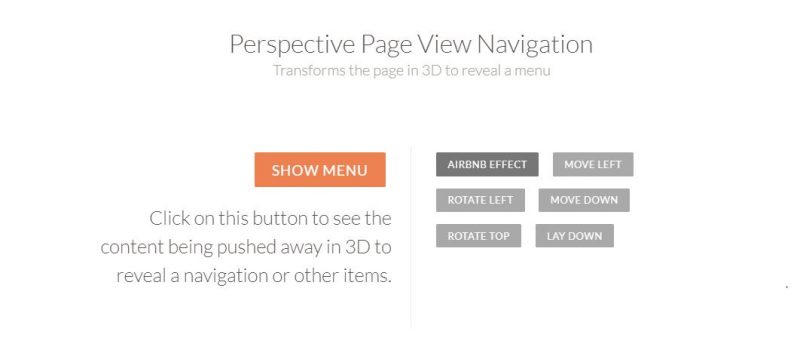
Perspective Page View Navigation
With some attractive navigational elements, the Perspective Page View Navigation showcases the menu items and the content on the menu of your website by pushing away the page in 3D.
The plugin helps you in creating interactive and responsive menus for any screen.
.ugb-291440e-wrapper.ugb-container__wrapper{padding-top:0 !important;padding-bottom:0 !important}.ugb-291440e-wrapper > .ugb-container__side{padding-top:35px !important;padding-bottom:35px !important}
.ugb-bc26052 .ugb-button1{background-color:#ff6900}.ugb-bc26052 .ugb-button1 .ugb-button–inner,.ugb-bc26052 .ugb-button1 svg:not(.ugb-custom-icon){color:#fefefe !important}
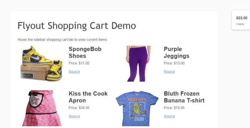
Hidden Flyout Shopping Cart Menu with CSS3
For all the e-commerce websites out there, this plugin is all that you need. Hidden Flyout Shopping Cart Menu with CSS3 is a clean and time-saving solution that lets your customers view the items they bought on a single page with all the relevant information. Worth a try!
.ugb-3ed163c-wrapper.ugb-container__wrapper{padding-top:0 !important;padding-bottom:0 !important}.ugb-3ed163c-wrapper > .ugb-container__side{padding-top:35px !important;padding-bottom:35px !important}
.ugb-1f16844 .ugb-button1{background-color:#ff6900}.ugb-1f16844 .ugb-button1 .ugb-button–inner,.ugb-1f16844 .ugb-button1 svg:not(.ugb-custom-icon){color:#fefefe !important}
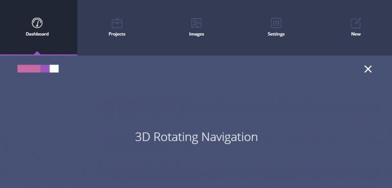
3D Rotating Navigation
3D is always fun, and when it comes to navigation menus, it is effective too. Especially for mobile apps, animated elements are the key ingredients of user experience. The 3D Rotating Navigation plugin lends a 3D effect to the menu of your website and gives an experience to the user that’s unmatched to basic-level coding.
.ugb-f854ad0-wrapper.ugb-container__wrapper{padding-top:0 !important;padding-bottom:0 !important}.ugb-f854ad0-wrapper > .ugb-container__side{padding-top:35px !important;padding-bottom:35px !important}
.ugb-83a0d77 .ugb-button1{background-color:#ff6900}.ugb-83a0d77 .ugb-button1 .ugb-button–inner,.ugb-83a0d77 .ugb-button1 svg:not(.ugb-custom-icon){color:#fefefe !important}
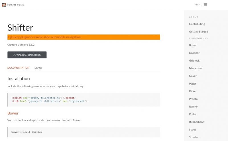
Shifter jQuery Plugin
If you are looking for a clean and responsive plugin for slide-out mobile navigations, Shifter is all that you need.
The plugin uses modern techniques like CSS3 and jQuery to offer an amazing experience to users of your website. Just set it up and watch your customer engagement escalate.
.ugb-bd9ab7c-wrapper.ugb-container__wrapper{padding-top:0 !important;padding-bottom:0 !important}.ugb-bd9ab7c-wrapper > .ugb-container__side{padding-top:35px !important;padding-bottom:35px !important}
.ugb-db44632 .ugb-button1{background-color:#ff6900}.ugb-db44632 .ugb-button1 .ugb-button–inner,.ugb-db44632 .ugb-button1 svg:not(.ugb-custom-icon){color:#fefefe !important}
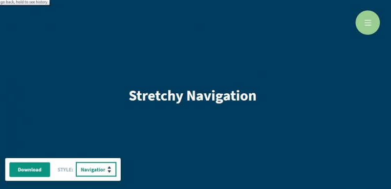
Stretchy Navigation
This plugin is a box full of features. It provides you with a default drop-down navigation menu with a single click/tap.
The Stretchy Navigation further comes with an option of adding a horizontal navigation tool that is well-suited for music sites.
.ugb-9b0c895-wrapper.ugb-container__wrapper{padding-top:0 !important;padding-bottom:0 !important}.ugb-9b0c895-wrapper > .ugb-container__side{padding-top:35px !important;padding-bottom:35px !important}
.ugb-c685963 .ugb-button1{background-color:#ff6900}.ugb-c685963 .ugb-button1 .ugb-button–inner,.ugb-c685963 .ugb-button1 svg:not(.ugb-custom-icon){color:#fefefe !important}
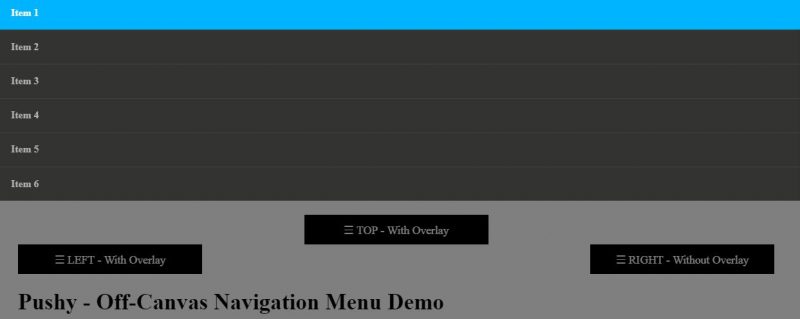
Pushy
Pushy is a simple, clean, and responsive off-canvas navigation menu that uses CSS transforms and transitions. The plugin is highly responsive and works well on a phone as well as desktop screens.
.ugb-5fe2625-wrapper.ugb-container__wrapper{padding-top:0 !important;padding-bottom:0 !important}.ugb-5fe2625-wrapper > .ugb-container__side{padding-top:35px !important;padding-bottom:35px !important}
.ugb-a61dcb3 .ugb-button1{background-color:#ff6900}.ugb-a61dcb3 .ugb-button1 .ugb-button–inner,.ugb-a61dcb3 .ugb-button1 svg:not(.ugb-custom-icon){color:#fefefe !important}
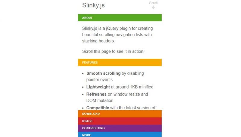
Slinky.Js
Slinky.Js is a jQuery plugin that helps in creating a beautiful and responsive navigation list with stacking headers. The different colors choices available to be used in the headers give it a unique look.
.ugb-8ec6703-wrapper.ugb-container__wrapper{padding-top:0 !important;padding-bottom:0 !important}.ugb-8ec6703-wrapper > .ugb-container__side{padding-top:35px !important;padding-bottom:35px !important}
.ugb-f6a851a .ugb-button1{background-color:#ff6900}.ugb-f6a851a .ugb-button1 .ugb-button–inner,.ugb-f6a851a .ugb-button1 svg:not(.ugb-custom-icon){color:#fefefe !important}
Horizontal Nav
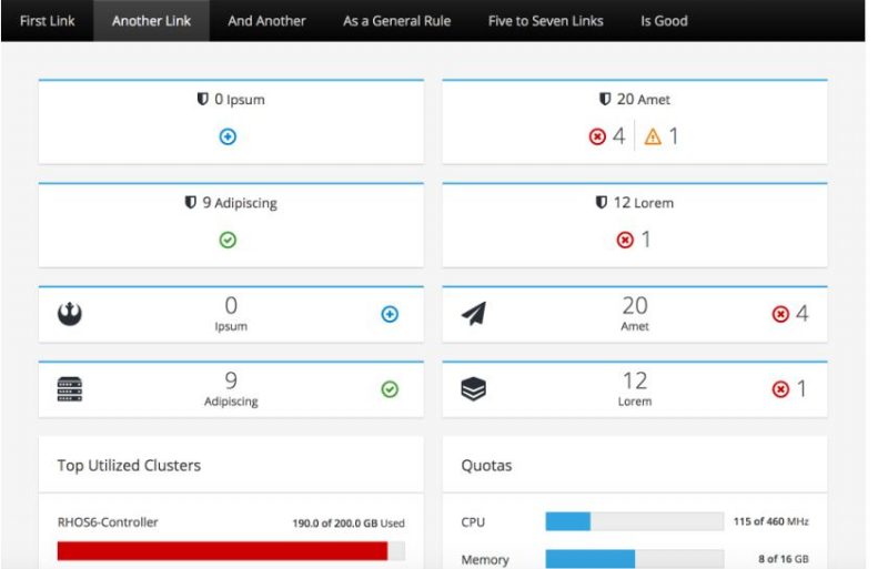
The Horizontal Nav menu is a responsive menu plugin that completely fits on the screen of every device. It is usually very difficult to create a horizontal menu effect for your website, but this plugin makes it easy.
.ugb-b9036f5-wrapper.ugb-container__wrapper{padding-top:0 !important;padding-bottom:0 !important}.ugb-b9036f5-wrapper > .ugb-container__side{padding-top:35px !important;padding-bottom:35px !important}
.ugb-a9ef118 .ugb-button1{background-color:#ff6900}.ugb-a9ef118 .ugb-button1 .ugb-button–inner,.ugb-a9ef118 .ugb-button1 svg:not(.ugb-custom-icon){color:#fefefe !important}
Mmenu
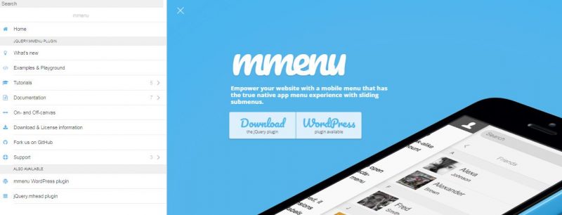
Do you want to make the app look-alike sliding menus for your mobile website? Use Mmenu jQuery plugin to create one.
With this beautifully designed plugin, you can create stunning navigational menu designs, and all this is done with a single line of javascript. Sleek and clean!
.ugb-eeaa2b0-wrapper.ugb-container__wrapper{padding-top:0 !important;padding-bottom:0 !important}.ugb-eeaa2b0-wrapper > .ugb-container__side{padding-top:35px !important;padding-bottom:35px !important}
.ugb-d9441c2 .ugb-button1{background-color:#ff6900}.ugb-d9441c2 .ugb-button1 .ugb-button–inner,.ugb-d9441c2 .ugb-button1 svg:not(.ugb-custom-icon){color:#fefefe !important}
SIDR
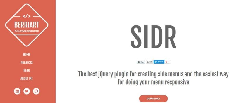
This is one of the best menu plugins on this list. As evident from its name, the SIDR plugin works amazingly for creating side menus and is the easiest way to make a responsive menu for mobile devices.
.ugb-8e26e87-wrapper.ugb-container__wrapper{padding-top:0 !important;padding-bottom:0 !important}.ugb-8e26e87-wrapper > .ugb-container__side{padding-top:35px !important;padding-bottom:35px !important}
.ugb-108e9cf .ugb-button1{background-color:#ff6900}.ugb-108e9cf .ugb-button1 .ugb-button–inner,.ugb-108e9cf .ugb-button1 svg:not(.ugb-custom-icon){color:#fefefe !important}
Menu Aim
Did you ever notice how responsive is the drop-down menu of Amazon? Well, even you can get a navigational menu like that with this plugin.
The Menu Aim opens up sub-menus as soon as the visitor’s cursor aims at drop-down menus thus making it easier for them to choose what they want in a hassle-free manner.
.ugb-8768535-wrapper.ugb-container__wrapper{padding-top:0 !important;padding-bottom:0 !important}.ugb-8768535-wrapper > .ugb-container__side{padding-top:35px !important;padding-bottom:35px !important}
.ugb-776466f .ugb-button1{background-color:#ff6900}.ugb-776466f .ugb-button1 .ugb-button–inner,.ugb-776466f .ugb-button1 svg:not(.ugb-custom-icon){color:#fefefe !important}
Section Navigation Menu
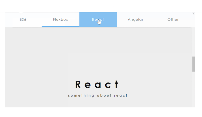
Quite true to its name, the Section Navigation Menu helps you create a responsive menu that is divided into different sections.
This plugin is specifically designed for a one-page scroll design that points to different sections of a long page.
.ugb-8a7d5a1-wrapper.ugb-container__wrapper{padding-top:0 !important;padding-bottom:0 !important}.ugb-8a7d5a1-wrapper > .ugb-container__side{padding-top:35px !important;padding-bottom:35px !important}
.ugb-3d312d4 .ugb-button1{background-color:#ff6900}.ugb-3d312d4 .ugb-button1 .ugb-button–inner,.ugb-3d312d4 .ugb-button1 svg:not(.ugb-custom-icon){color:#fefefe !important}
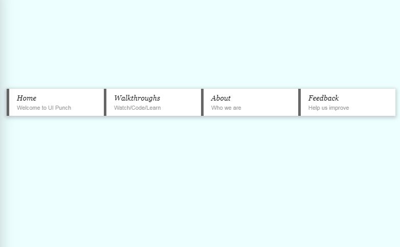
Navigation With Hover Effects
The Navigation with Hover Effects is a set of multiple navigation menus that come with a white-yellow color combination. The navigation shows the power of CSS with its amazingly designed fills, shapes, and stripes.
.ugb-65a140a-wrapper.ugb-container__wrapper{padding-top:0 !important;padding-bottom:0 !important}.ugb-65a140a-wrapper > .ugb-container__side{padding-top:35px !important;padding-bottom:35px !important}
.ugb-839f89b .ugb-button1{background-color:#ff6900}.ugb-839f89b .ugb-button1 .ugb-button–inner,.ugb-839f89b .ugb-button1 svg:not(.ugb-custom-icon){color:#fefefe !important}
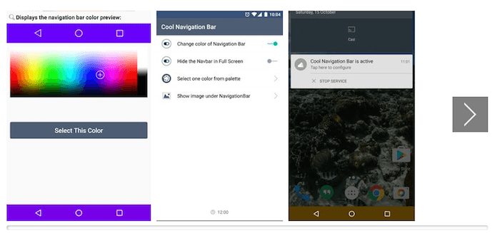
Cool Navigation
The Cool Navigation Menu is as cool as its name, and it appears on the website only after you scroll down to a certain height. The plugin is highly responsive and looks elegant on all kinds of websites.
.ugb-3dc17df-wrapper.ugb-container__wrapper{padding-top:0 !important;padding-bottom:0 !important}.ugb-3dc17df-wrapper > .ugb-container__side{padding-top:35px !important;padding-bottom:35px !important}
.ugb-df52b15 .ugb-button1{background-color:#ff6900}.ugb-df52b15 .ugb-button1 .ugb-button–inner,.ugb-df52b15 .ugb-button1 svg:not(.ugb-custom-icon){color:#fefefe !important}
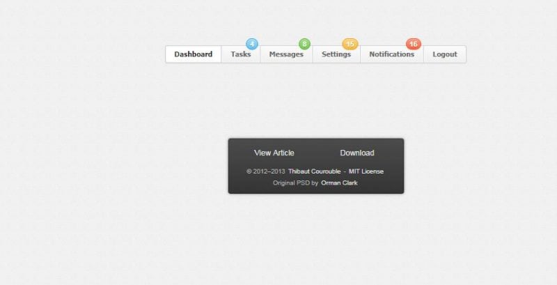
Menu With Notification Badges
This navigation menu comes with notification badges and is best for websites that focus on user engagement.
The colorful notification badges display the number of notifications as well making the menu of your website highly attractive.
.ugb-088a102-wrapper.ugb-container__wrapper{padding-top:0 !important;padding-bottom:0 !important}.ugb-088a102-wrapper > .ugb-container__side{padding-top:35px !important;padding-bottom:35px !important}
.ugb-83827ae .ugb-button1{background-color:#ff6900}.ugb-83827ae .ugb-button1 .ugb-button–inner,.ugb-83827ae .ugb-button1 svg:not(.ugb-custom-icon){color:#fefefe !important}
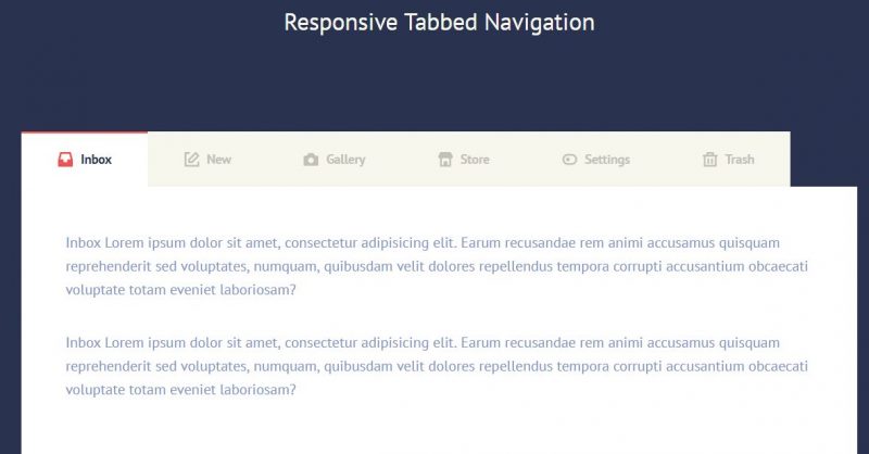
Responsive Tabbed Navigation Menu
The Tabbed Navigation Menu is a responsive and elegant navigation menu that comes in tabular form. It elegantly displays your menu items in a dropdown menu form and looks perfect on every device.
.ugb-0460924-wrapper.ugb-container__wrapper{padding-top:0 !important;padding-bottom:0 !important}.ugb-0460924-wrapper > .ugb-container__side{padding-top:35px !important;padding-bottom:35px !important}
.ugb-34fe89e .ugb-button1{background-color:#ff6900}.ugb-34fe89e .ugb-button1 .ugb-button–inner,.ugb-34fe89e .ugb-button1 svg:not(.ugb-custom-icon){color:#fefefe !important}
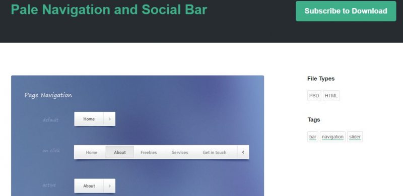
Pale Navigation and Social Bar
Pale Navigation and Social Bar is a perfect choice for creating an interactive navigation menu or even a social navigation menu.
It is designed in a way that it occupies the horizontal space of the device and makes your website look great.
.ugb-499d13d-wrapper.ugb-container__wrapper{padding-top:0 !important;padding-bottom:0 !important}.ugb-499d13d-wrapper > .ugb-container__side{padding-top:35px !important;padding-bottom:35px !important}
.ugb-145e938 .ugb-button1{background-color:#ff6900}.ugb-145e938 .ugb-button1 .ugb-button–inner,.ugb-145e938 .ugb-button1 svg:not(.ugb-custom-icon){color:#fefefe !important}
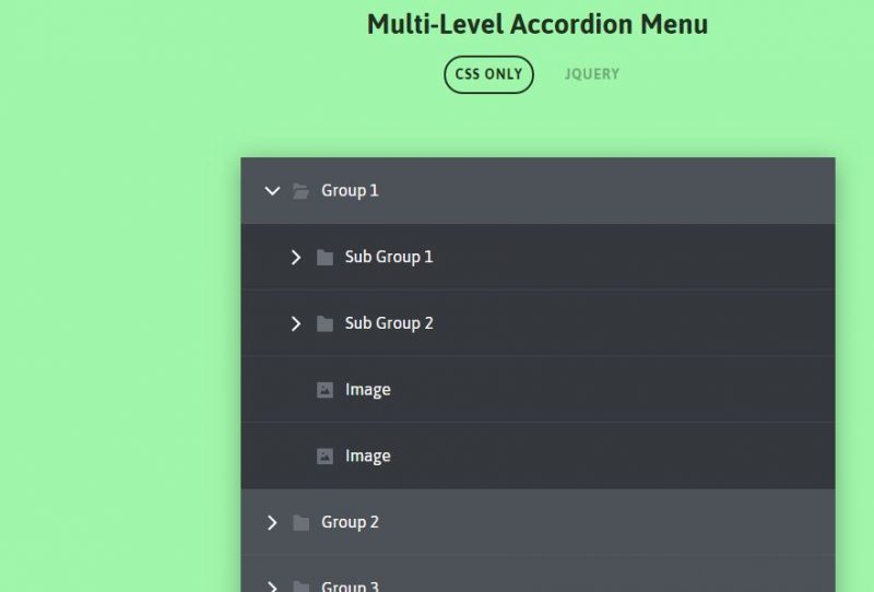
CSS Accordion Menu
This navigation menu is fully coded with HTML and CSS and also comes as a PSD file.
With using CSS Accordion Menu, the top-level elements of your website can be easily expanded and contracted, with different states of hover and click elements.
.ugb-3d1b8d2-wrapper.ugb-container__wrapper{padding-top:0 !important;padding-bottom:0 !important}.ugb-3d1b8d2-wrapper > .ugb-container__side{padding-top:35px !important;padding-bottom:35px !important}
.ugb-ba4a9d9 .ugb-button1{background-color:#ff6900}.ugb-ba4a9d9 .ugb-button1 .ugb-button–inner,.ugb-ba4a9d9 .ugb-button1 svg:not(.ugb-custom-icon){color:#fefefe !important}
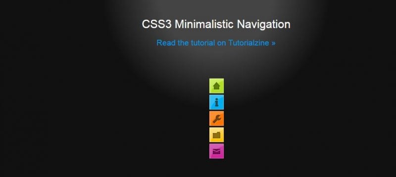
CSS3 Minimalistic Navigation Menu
As evident from the name, the CSS3 Minimalistic Navigation Menu helps you in creating a highly responsive menu that is elegantly designed and includes animations too!
.ugb-739a582-wrapper.ugb-container__wrapper{padding-top:0 !important;padding-bottom:0 !important}.ugb-739a582-wrapper > .ugb-container__side{padding-top:35px !important;padding-bottom:35px !important}
.ugb-cd82e40 .ugb-button1{background-color:#ff6900}.ugb-cd82e40 .ugb-button1 .ugb-button–inner,.ugb-cd82e40 .ugb-button1 svg:not(.ugb-custom-icon){color:#fefefe !important}
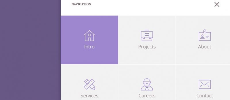
3D Bold Navigation
Anything that is seen or experienced in 3D is more clean and detailed. The 3D Bold Navigation plugin helps you in creating impressive navigation menus that slide in when active and replace the current contents in a 3D space.
.ugb-353291b-wrapper.ugb-container__wrapper{padding-top:0 !important;padding-bottom:0 !important}.ugb-353291b-wrapper > .ugb-container__side{padding-top:35px !important;padding-bottom:35px !important}
.ugb-b193793 .ugb-button1{background-color:#ff6900}.ugb-b193793 .ugb-button1 .ugb-button–inner,.ugb-b193793 .ugb-button1 svg:not(.ugb-custom-icon){color:#fefefe !important}
Responsive Sidebar Navigation
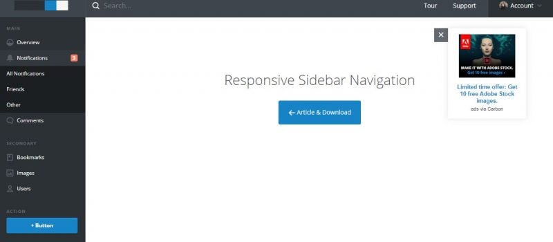
As evident from the name, the Responsive Sidebar Navigation is a stylish and responsive navigation menu plugin.
It is an easy-to-integrate side and vertical menu plugin and is ideal for creating menus in dashboards and admin areas.
.ugb-994b3aa-wrapper.ugb-container__wrapper{padding-top:0 !important;padding-bottom:0 !important}.ugb-994b3aa-wrapper > .ugb-container__side{padding-top:35px !important;padding-bottom:35px !important}
.ugb-3ab1d75 .ugb-button1{background-color:#ff6900}.ugb-3ab1d75 .ugb-button1 .ugb-button–inner,.ugb-3ab1d75 .ugb-button1 svg:not(.ugb-custom-icon){color:#fefefe !important}
Multi-Level Push Menu jQuery PlugIn
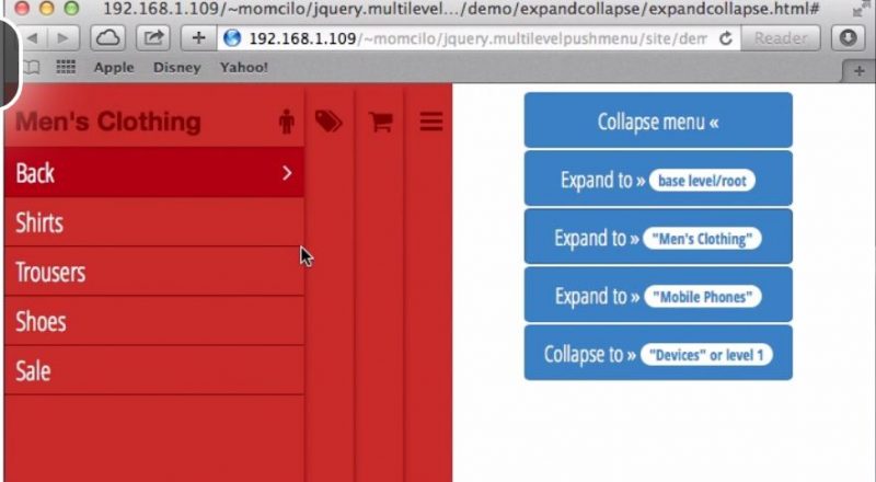
The Multi-Level Push Menu jQuery PlugIn comes with some really impressive features and helps you create menus with cross-browser compatibility.
This jQuery plugin allows endless nesting of navigation elements on the menu and suits all kinds of websites.
.ugb-5cd8e59-wrapper.ugb-container__wrapper{padding-top:0 !important;padding-bottom:0 !important}.ugb-5cd8e59-wrapper > .ugb-container__side{padding-top:35px !important;padding-bottom:35px !important}
Rounded Animation Navigation
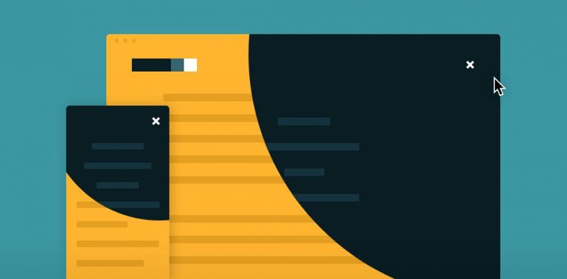
Horizontal and vertical menus are too clichéd, so this plugin brings to you a navigation that expands in a circle. This is a full-screen navigation plugin that is animated with the help of CSS3 and jQuery.
.ugb-e9ac7f1-wrapper.ugb-container__wrapper{padding-top:0 !important;padding-bottom:0 !important}.ugb-e9ac7f1-wrapper > .ugb-container__side{padding-top:35px !important;padding-bottom:35px !important}
.ugb-6490fe3 .ugb-button1{background-color:#ff6900}.ugb-6490fe3 .ugb-button1 .ugb-button–inner,.ugb-6490fe3 .ugb-button1 svg:not(.ugb-custom-icon){color:#fefefe !important}
Slide in Panel Navigation Plugin
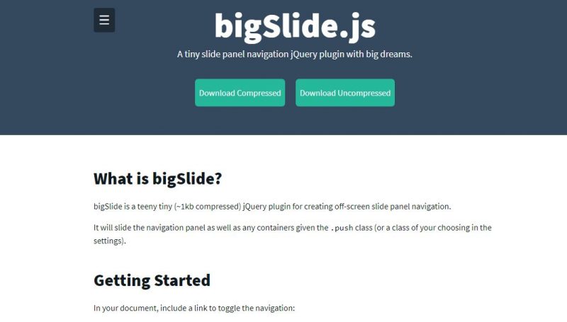
Powered by CSS3 and jQuery, this menu plugin has an amazing slide-in panel. The panel quickly shows the side content, notification or profile information within seconds.
Most of all, it works well on all kinds of websites.
.ugb-aab6081-wrapper.ugb-container__wrapper{padding-top:0 !important;padding-bottom:0 !important}.ugb-aab6081-wrapper > .ugb-container__side{padding-top:35px !important;padding-bottom:35px !important}
.ugb-c443558 .ugb-button1{background-color:#ff6900}.ugb-c443558 .ugb-button1 .ugb-button–inner,.ugb-c443558 .ugb-button1 svg:not(.ugb-custom-icon){color:#fefefe !important}
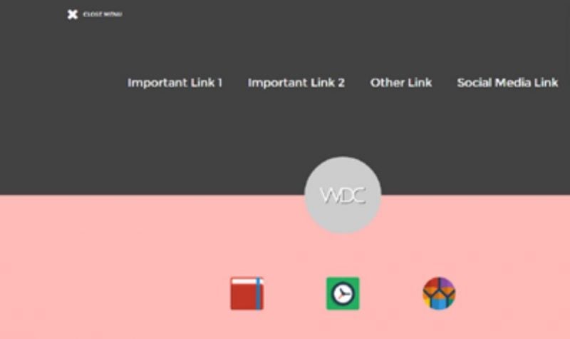
Closing Door Menu PlugIn
This menu plugin is a very creative one. It is in the form of a closing door. The two sides of the menu come together off-screen to make the final menu creating a really attractive menu animation for your website.
.ugb-bb6e6d5-wrapper.ugb-container__wrapper{padding-top:0 !important;padding-bottom:0 !important}.ugb-bb6e6d5-wrapper > .ugb-container__side{padding-top:35px !important;padding-bottom:35px !important}
.ugb-8ebf723 .ugb-button1{background-color:#ff6900}.ugb-8ebf723 .ugb-button1 .ugb-button–inner,.ugb-8ebf723 .ugb-button1 svg:not(.ugb-custom-icon){color:#fefefe !important}
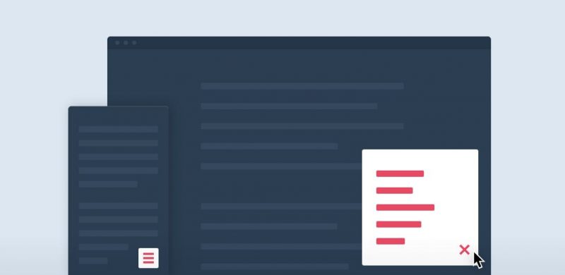
Smart Fixed Navigation
The Smart Fixed Navigation is a fixed navigation that allows the users to access the menu anytime while they are going through your website.
Though it is smaller than a full-width fixed header with no back-to-top button, it comes with a smarter one-click UX solution to compensate for it all.
.ugb-47f41d2-wrapper.ugb-container__wrapper{padding-top:0 !important;padding-bottom:0 !important}.ugb-47f41d2-wrapper > .ugb-container__side{padding-top:35px !important;padding-bottom:35px !important}
.ugb-dfe0b7f .ugb-button1{background-color:#ff6900}.ugb-dfe0b7f .ugb-button1 .ugb-button–inner,.ugb-dfe0b7f .ugb-button1 svg:not(.ugb-custom-icon){color:#fefefe !important}
Full-Screen Pop out Navigation
This is a fixed and full-screen navigation menu that catches your audience’s attention with its call-to-action button first and then lets them explore the menu and the website further. Truly Engaging!

.ugb-9f98643-wrapper.ugb-container__wrapper{padding-top:0 !important;padding-bottom:0 !important}.ugb-9f98643-wrapper > .ugb-container__side{padding-top:35px !important;padding-bottom:35px !important}
.ugb-63f269a .ugb-button1{background-color:#ff6900}.ugb-63f269a .ugb-button1 .ugb-button–inner,.ugb-63f269a .ugb-button1 svg:not(.ugb-custom-icon){color:#fefefe !important}
jQuery Square Menu
jQuery Square Menu is a simple and minimalistic animation-based navigation menu created using advanced technologies like jQuery and CSS3. The menu is square and looks professional on every kind of device.
.ugb-69215ba-wrapper.ugb-container__wrapper{padding-top:0 !important;padding-bottom:0 !important}.ugb-69215ba-wrapper > .ugb-container__side{padding-top:35px !important;padding-bottom:35px !important}
.ugb-d34fb78 .ugb-button1{background-color:#ff6900}.ugb-d34fb78 .ugb-button1 .ugb-button–inner,.ugb-d34fb78 .ugb-button1 svg:not(.ugb-custom-icon){color:#fefefe !important}
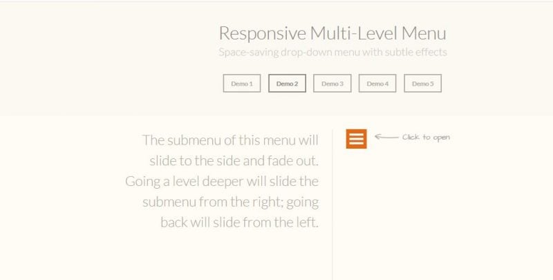
Responsive Multi-Level Menu
Just like all other menus on the list, Responsive Multi-Level Menu is also a responsive menu plugin. The menu showcases the submenus in an elegant manner on the same page, thus saving space and usage on your website.
.ugb-786c2a0-wrapper.ugb-container__wrapper{padding-top:0 !important;padding-bottom:0 !important}.ugb-786c2a0-wrapper > .ugb-container__side{padding-top:35px !important;padding-bottom:35px !important}
.ugb-0189710 .ugb-button1{background-color:#ff6900}.ugb-0189710 .ugb-button1 .ugb-button–inner,.ugb-0189710 .ugb-button1 svg:not(.ugb-custom-icon){color:#fefefe !important}
Flaunt.JS
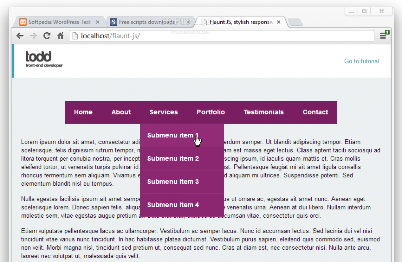
Backed by advanced technology like jQuery, this navigation menu plugin allows you to create subtle, responsive, and nested navigation menus.
With Flaunt.JS, you can flaunt the design of your website.
.ugb-a3c05bb-wrapper.ugb-container__wrapper{padding-top:0 !important;padding-bottom:0 !important}.ugb-a3c05bb-wrapper > .ugb-container__side{padding-top:35px !important;padding-bottom:35px !important}
.ugb-70bfe60 .ugb-button1{background-color:#ff6900}.ugb-70bfe60 .ugb-button1 .ugb-button–inner,.ugb-70bfe60 .ugb-button1 svg:not(.ugb-custom-icon){color:#fefefe !important}
Responsive Retina Ready Menu
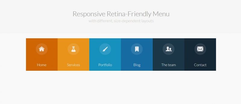
Yes, you read that right, this menu is retina-ready! Responsive Retina Ready Menu automatically changes into one of the three layouts depending on the browser size on which it is being opened.
The mobile version comes with a menu link to display the content and hides the navigation for small screens.
.ugb-d7556f3-wrapper.ugb-container__wrapper{padding-top:0 !important;padding-bottom:0 !important}.ugb-d7556f3-wrapper > .ugb-container__side{padding-top:35px !important;padding-bottom:35px !important}
.ugb-3f10bef .ugb-button1{background-color:#ff6900}.ugb-3f10bef .ugb-button1 .ugb-button–inner,.ugb-3f10bef .ugb-button1 svg:not(.ugb-custom-icon){color:#fefefe !important}
Drop Down Responsive Menu
Instilled with the latest technologies like jQuery and CSS3, this plugin enhances the design and layout of the navigation menu on your website and fits amazingly different screen sizes.
Drop Down Responsive Menu is well compatible with small screen devices as well and will keep your audience hooked.
.ugb-cab4a01-wrapper.ugb-container__wrapper{padding-top:0 !important;padding-bottom:0 !important}.ugb-cab4a01-wrapper > .ugb-container__side{padding-top:35px !important;padding-bottom:35px !important}
.ugb-98bc1ce .ugb-button1{background-color:#ff6900}.ugb-98bc1ce .ugb-button1 .ugb-button–inner,.ugb-98bc1ce .ugb-button1 svg:not(.ugb-custom-icon){color:#fefefe !important}
Mega Site Navigation
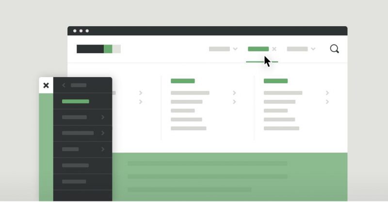
A mega website needs a mega navigation menu. This is a responsive and easy-to-customize plugin enriched by CSS3 animations and jQuery and lets you create highly responsive menus.
.ugb-4568112-wrapper.ugb-container__wrapper{padding-top:0 !important;padding-bottom:0 !important}.ugb-4568112-wrapper > .ugb-container__side{padding-top:35px !important;padding-bottom:35px !important}
.ugb-a3a3b18 .ugb-button1{background-color:#ff6900}.ugb-a3a3b18 .ugb-button1 .ugb-button–inner,.ugb-a3a3b18 .ugb-button1 svg:not(.ugb-custom-icon){color:#fefefe !important}
Responsive Slider Drawer Menu with Lightbox Effect
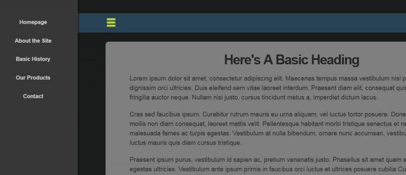
Responsive Slider Drawer Menu with Lightbox Effect navigation menu plugin has a hidden sliding menu for small as well as large-screen displays.
The plugin is highly responsive and saves screen space by hiding the navigation when it is not required.
.ugb-693cedf-wrapper.ugb-container__wrapper{padding-top:0 !important;padding-bottom:0 !important}.ugb-693cedf-wrapper > .ugb-container__side{padding-top:35px !important;padding-bottom:35px !important}
.ugb-77c2fd0 .ugb-button1{background-color:#ff6900}.ugb-77c2fd0 .ugb-button1 .ugb-button–inner,.ugb-77c2fd0 .ugb-button1 svg:not(.ugb-custom-icon){color:#fefefe !important}
Moving Boxes jQuery Menu
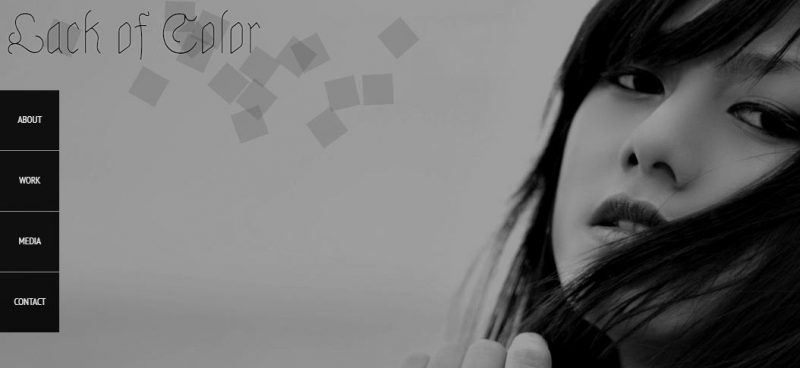
Moving Boxes jQuery Menu plugin is a creative one. Many little boxes are scattered on the top of the site which animates together to form the main content area when the menu option is a click. Clean and beautiful!
.ugb-2ef0db0-wrapper.ugb-container__wrapper{padding-top:0 !important;padding-bottom:0 !important}.ugb-2ef0db0-wrapper > .ugb-container__side{padding-top:35px !important;padding-bottom:35px !important}
.ugb-bc20e02 .ugb-button1{background-color:#ff6900}.ugb-bc20e02 .ugb-button1 .ugb-button–inner,.ugb-bc20e02 .ugb-button1 svg:not(.ugb-custom-icon){color:#fefefe !important}
Smartmenus
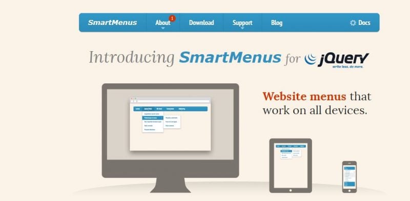
Smartmenus plugin is indeed a smart one! This beautifully designed drop-down menu is created using CSS3 and jQuery and enables you to create responsive multi-level drop-down menus with attractive link icons.
.ugb-a79706d-wrapper.ugb-container__wrapper{padding-top:0 !important;padding-bottom:0 !important}.ugb-a79706d-wrapper > .ugb-container__side{padding-top:35px !important;padding-bottom:35px !important}
.ugb-5c30086 .ugb-button1{background-color:#ff6900}.ugb-5c30086 .ugb-button1 .ugb-button–inner,.ugb-5c30086 .ugb-button1 svg:not(.ugb-custom-icon){color:#fefefe !important}
Animated Content Menu with jQuery
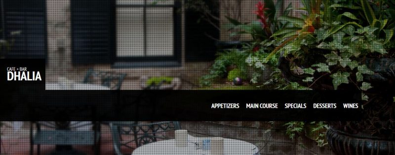
The Animated Content Menu with jQuery is a sleek animated content menu that is highly responsive and is created using jQuery.
All the menu items are animated, and on clicking a content area, more information appears. What’s more? You get all of it for free.
.ugb-d17a651-wrapper.ugb-container__wrapper{padding-top:0 !important;padding-bottom:0 !important}.ugb-d17a651-wrapper > .ugb-container__side{padding-top:35px !important;padding-bottom:35px !important}
.ugb-165d937 .ugb-button1{background-color:#ff6900}.ugb-165d937 .ugb-button1 .ugb-button–inner,.ugb-165d937 .ugb-button1 svg:not(.ugb-custom-icon){color:#fefefe !important}
Final Word
Building a website that connects with the audience is not everyone’s piece of cake, but with useful and highly attractive tools like jQuery, adding beautiful navigational elements to your website becomes as easy as downloading a plugin.
So what are you waiting for? Go and download a jQuery Menu Plugin for your website and get going!