When you share any post on social media sites like Facebook, Instagram, Pinterest, the font makes a big difference.
We sometimes forget how integral fonts are in the digital world, and how they can easily accentuate or discredit your content if used improperly.
This also explains why it is a sought-out medium for visual branding because it has managed to garner more eyeballs than any other form of digital media.
Therefore, it is only justified that you publish your content where there is more visibility.
Importance of Fonts in Social Media Posts
When it comes to social media posts, the right font can make all the difference. With so many different platforms and ways to share content, it’s important to choose a font that is easy to read and visually appealing.
The wrong font choice can make your posts look unprofessional or even confusing. It can also deter people from reading your content altogether. On the other hand, an eye-catching and stylish font can make your posts pop and help you stand out from the rest.
There are a few things to keep in mind when choosing a font for your social media posts. First, consider the nature of your content. If you’re sharing something serious or informative, you’ll want to choose a font that is easy to read and conveys a sense of authority.
If you’re sharing something lighthearted or fun, however, you can afford to be a bit more creative with your font choice. In general, it’s best to avoid using more than two different fonts in your posts.
Let’s have a look at this comprehensive list of Best Fonts for Social Media.
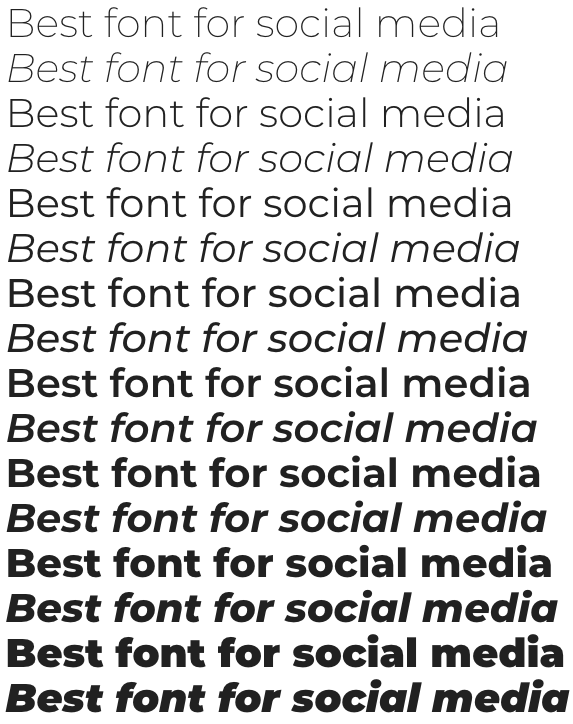
Montserrat
One of the classical and timeless fonts, you can never go wrong with a Montserrat text, which helps your posts in evoking their genuine naturality and vigour.
It is professional, functional and largely versatile, thus can go with all kinds of content. It is a perfect fit for brand advertisement, as it enhances formal aestheticism.
It is a seamless blend of Serif and Sans serif, giving you the best of both worlds.
Novecento
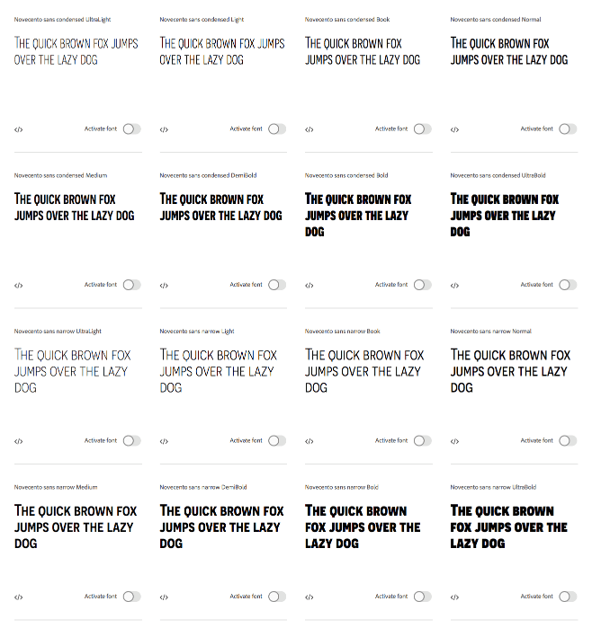
This quirky, stocky and naturally bold font can prove to be of large assistance if you want to attract attention to your post.
If you are one of those bloggers who aspire to have an elaborate banner or a picture grid on their Instagram profiles- then this font can come in quite handy.
When someone is merely browsing through your profile and not looking through each post in detail, Novecento is the well-suited choice.
Anton
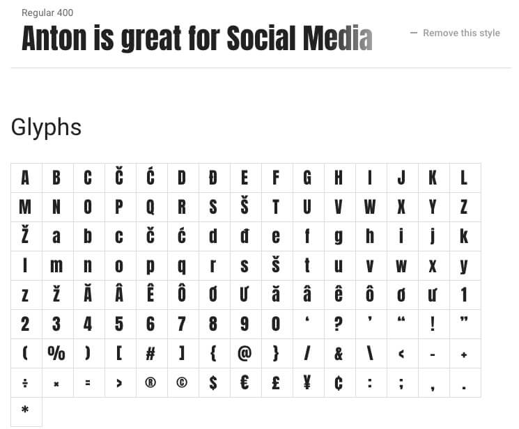
Anton is another very popular Google Fonts that you can use on your social media banners. If you are active on Pinterest, Anton can be a great fond as it is a bold font with good readability making it suitable for Pinterest traffic coming through the mobile phones.
Helvetica
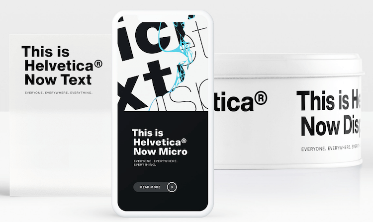
This font family houses 7 varied forms of the font, ranging from light, light oblique, regular, regular oblique to bold and bold oblique. Basically, every form has two options.
Not entirely conducive for logos, Helvetica’s excellence can be used in any size or form for all kinds of large captions or headlines.
It has been known as a component of visual branding.
PT Sans
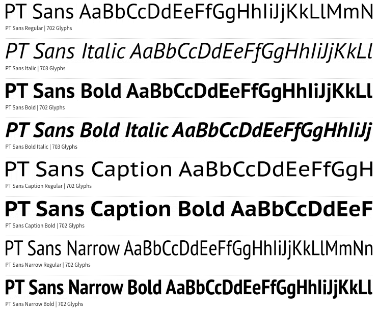
PT Sans has an air of flair and formality to its typeface, making it a reliable choice for your textual content. If you are used to adding dates or locations on your Instagrammable pictures, then PT Sans is the one for you.
It is slim and subtle, will not overshadow the brilliance of your picture but will still ensure that the letters are registered by the audience.
This will help you document your travel and memories, by mentioning the dates and place.
Playfair Display
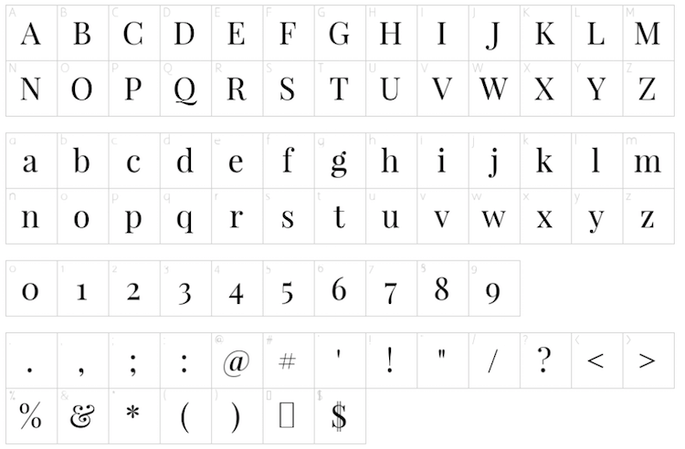
Chiselled with grace and elegance, this font is preferred across mediums and for various uses, owing to its versatility.
Bloggers and freelancers in the content marketing industry are all for praises for this font, but that doesn’t mean it cannot be used for posters or videos with sparse textual content.
It has a subtle appeal to its charm.
GT Walsheim
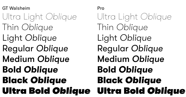
Amply spaced with rounded letters, GT Walsheim is supported across digital formats, and has transcended into the sphere of social media.
It can be an unusually useful choice for banners or animated texts in videos, that you need the audience to absorb- without taking away too much attention from the visual content.
Merriweather
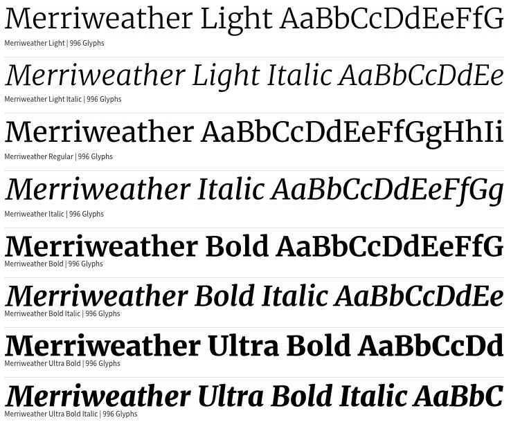
Conducive to all types of media and content, Merriweather is a classical font that isn’t too experimental and can get the job done.
Having been used in paragraphs, captions, headlines to personal quotes and poetry verses- this font can do justice to all of them.
If you have a post featuring quotes or a prose account filled with literary posts, this is the font that will give it a uniform overview and individual glamour.
Open Sans
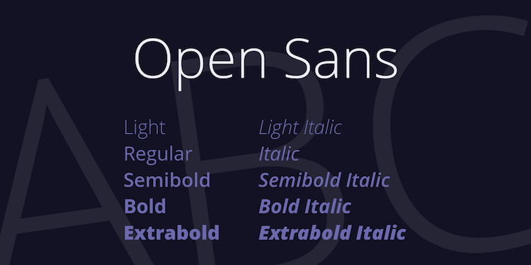
With functions similar to that of Merriweather due to their physical similarities, Open Sans also revels in its versatility and flexibility.
Its slim and upright structure is a favorite of web designers and common addition to their digital pieces; which have wormed their way into social media.
Stay Writer
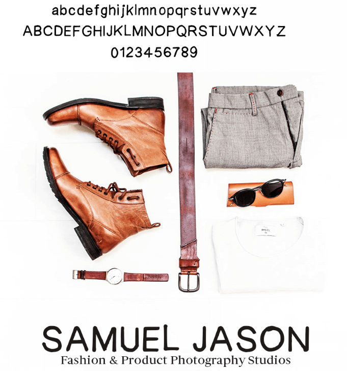
This is crafted exclusively for artistic posts or videos. With jagged lines, this exudes the feel of a homely handwritten letter.
It can be used to caption abstract forms of art like prose, poetry or even murals. With brands looking to incorporate aspects reflecting human touch, to make their products or services seem more approachable – Stay Writer is a viable option.
Nawabiat
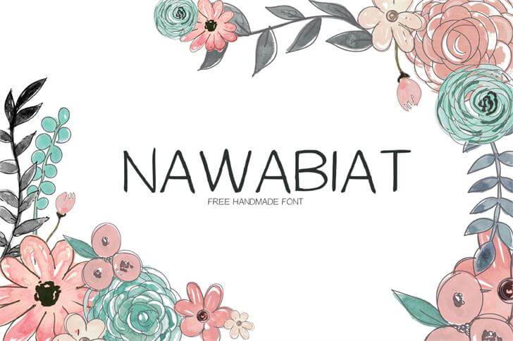
This Middle-eastern handwritten font is relatively more refined than Stay writer in terms of steadier strokes.
An infamous choice amongst teenagers and young adults, Nawabiat can be your go-to option if you like posting philosophy or even two-lined prose or shaayiris.
It is also known for its vibrant personality.
Tikal Sans
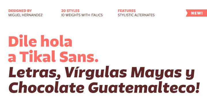
With 6 variations under its belt, this multifaceted font can be used in all sizes and has varied uses owing to the several forms.
Reflecting a sense of strong character, Tikal Sans in its light form is perfect for subtitles in videos; and headlines in its emboldened character.
It’s known for its unconventionality.
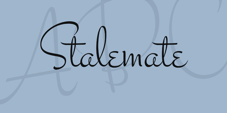
Stalemate
Cursive with strong and inefficient brushstrokes, Stalemate is a decorative font that does not compromise or legality or readability.
With an impressive 12 options, this font can make banners look extremely ornate while also retaining their simple glory and purpose. With a vintage edge, it is widely used for headlines.
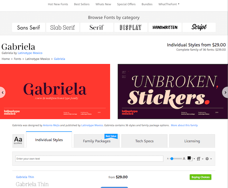
Gabriela
With a feminine touch and a rustic appeal, its cursive lettering with elaborate endings to each alphabet makes it distinctive and unique.
Used extensively by fashion and jewelry brands, this can be a perfect addition to your social media extravagance, and can also contribute to it!
Della Raspira
Not as ornate as Gabriela and neither as upright and sharp as Merriweather, Della Raspira strikes a perfect balance by incorporating the benefits of both and forging them into a singular font.
If your video contains disappearing and reappearing text, this is the font choice you have to make. Can be used for advertising your books on social media.
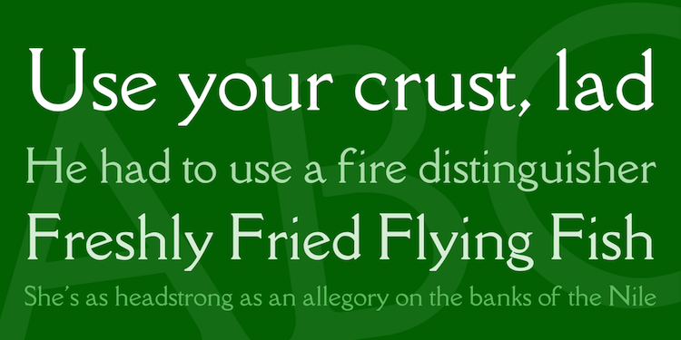
Neuton
An epitome of High and Mighty, Neuton is exalting in its own way although it is largely made up of basic or mediocre elements.
Its uniform and formal lettering can be used for diversified content, and its cross-browser compatibility to duly noted.
It is compact and perfect for longer paragraphs or text-heavy visuals.

Junge
Junge is explicably precise in its mundanity yet can be quite captivating when used in the right context. It is curved around the edges alongside its relatively sharp features while harboring a flair of delicacy.
It can be very useful if you wish to add captions to your photographs before posting them.
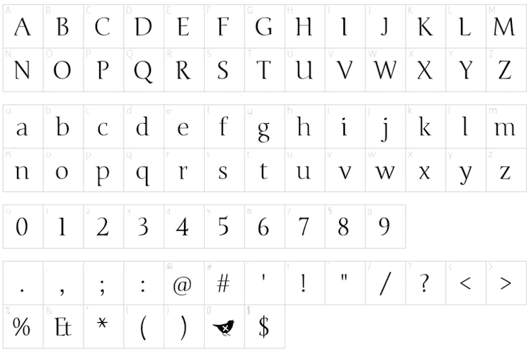
Ramaraja
With a naturally emboldened self, it is a sight for sore eyes. This can be compatible with logos as well, which fuelled its popularity in the first place; in addition to being evidently very functional and works best with all kinds of designs.
If you want to catch your audience’s eye, then this is the one.
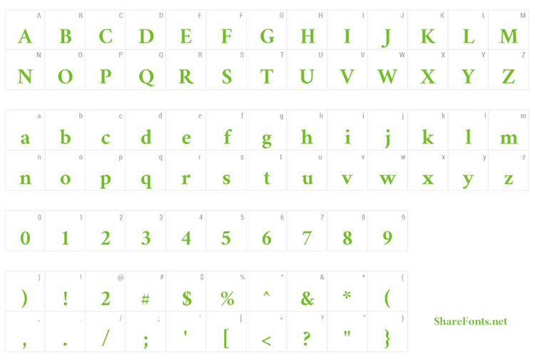
Quicksand
With its slim and sharp strokes coupled with amply spaced lettering, Quicksand is one of a kind.
Having worked successfully for both headers and body text, it can also be used for graphic visualization onscreen without seeming too heavy or crowded.
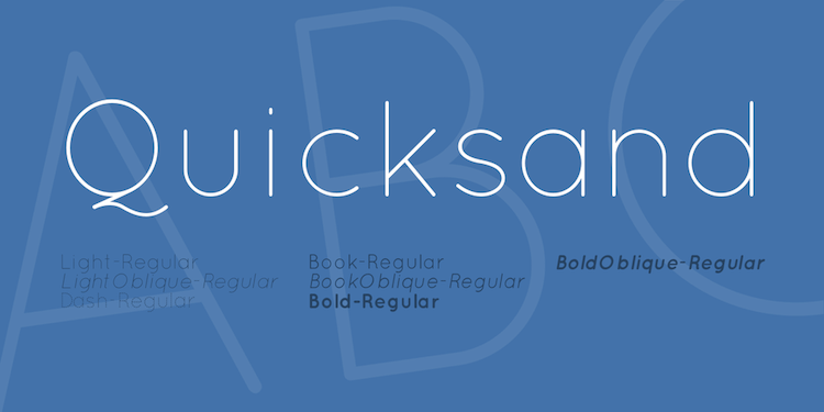
Abel
Abel’s compressed and upright figure might strike as boring or monotonous initially. However, its ability to grab eyeballs does not fail in comparison to the others.
Resembling a typist font, this can be used to reveal the title of your movie or clips in a typewriter fashion and works well across sizes and themes.
Abel is also one of the fonts that have been deemed suitable especially for infographics.
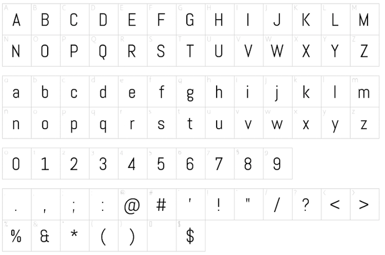
Tuffy
As quirky and cheeky as the name sounds, the font is no different. With slightly thicker and curvaceous lettering, Tuffy is perfect if your content is aimed to please children or pre-teens.
It can be used in commercials and posters, eliciting an enjoyable response from the younger audience without being too elaborate or decorative.
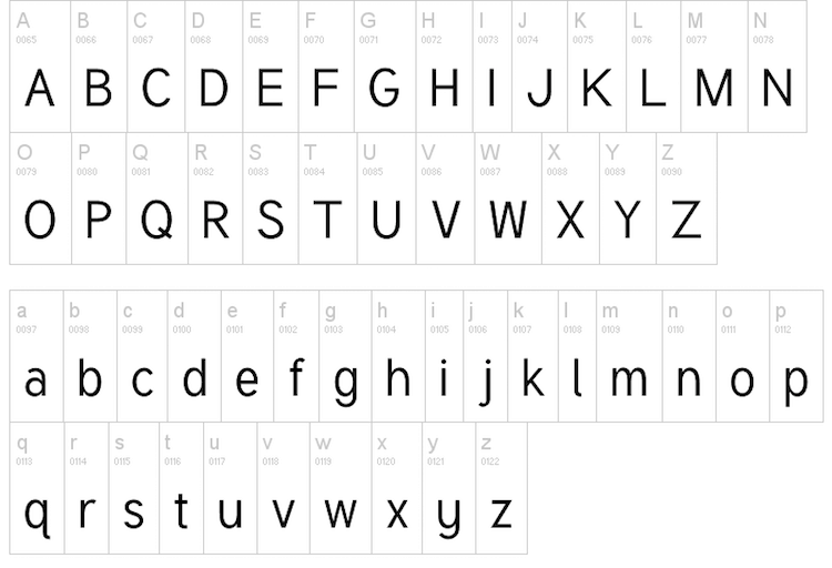
Ruluko
Ruluko is what comes out when handwritten letters get a typewriter transformation. All of us would have envied someone’s extremely appealing and neat handwriting at some point.
Well, this is that with a digitized edge and uniform structure.
This can maintain a neat look for your finsta (or fake Instagram) if you decide on posting your stories or segregated written content like stories and prose.
Zeyada
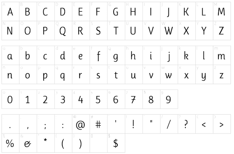
Most videos start off with chalk writing on the blackboard or a pen scribbling on apiece of paper. Zeyada is the font used to depict the writing in these contexts and does a fine job at that.
If you’re going for a ‘grocery list meets notepad’ kind of theme, then Zeyada can prove to be an ingenious pick.
Dancing Script
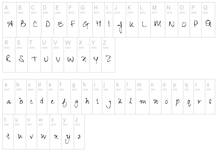
Travel bloggers or photographers on social media have resorted to new ways of displaying their work on these mediums. One of the common ones is encasing their well-shot snaps into a plain white background with a caption underneath it.
Dancing Script is what can be used to accentuate your pictures with text.
Autour One
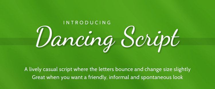
With a medieval and ethnic appeal gushing out of its structure, Autour One is formed explicitly with curved alphabets, which are wide and reflect anciency.
Having been a predominant choice of folk book covers or posters, it can serve as a contrast against your modern design or complement your old-school one!

Rock Salt
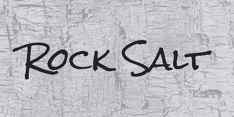
Writing on polaroids is one of the most millennial things that are showcased on Instagram. If you wish to acquire that look digitally, then make sure to check out the Rock Salt font.
Made of scrawny handwritten alphabets, which are slightly shabby but perfectly legible- you can use impose these on your photographs making it seem as authentic as a polaroid.
Calligraffiti
This is the answer to what would happen when calligraphy met graffiti. Comprising mainly oh jagged lines but with thinner strokes and regal elegance, this is an inarguably unique font that deserves more attention.
This can be used for credits or special mentions in a video or while revealing an empathetic post to a beloved one. It depicts emotions and evoked feel.
Poiret One
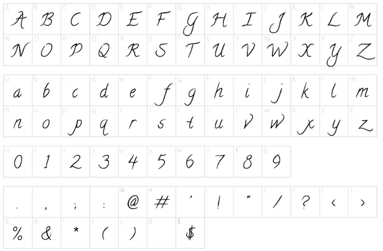
Sleek, simple and artistic- these best describe the characteristics of Poiret One. Its curvy yet highly legible lettering can play as you please.
Predominantly used for short texts, this font is largely geometrical and is significantly made up of curves and straight lines. It can be used for post labels, signs and poster headlines.
Nunito
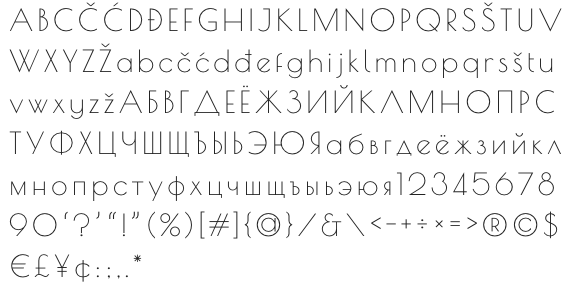
A favourite of web developers, Nunito’s popularity grow after its mobile-friendly optimisations.
Social media is predominantly used on phones and other allied devices like iPods, and hence it is important that fonts are accessible and readable; increasing your content or your post’s visibility.
This also means it can be easily shared and understood by multiple users.

Amatic SC
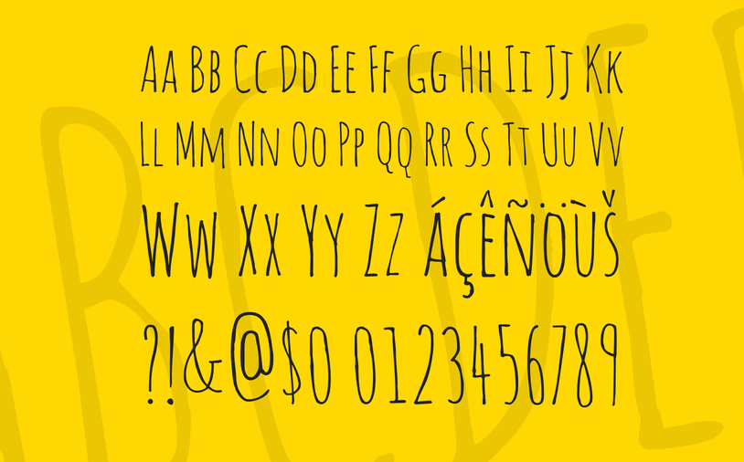
A personal favorite of the creative industry, Amatic SC is a digital riot and one that you cannot go wrong with.
Having worked best in capitals, this font is slender and the delicate and jagged lines induce an informal and fun appeal.
This can be used to make announcements or reveal something to your fan following.
Olivetta
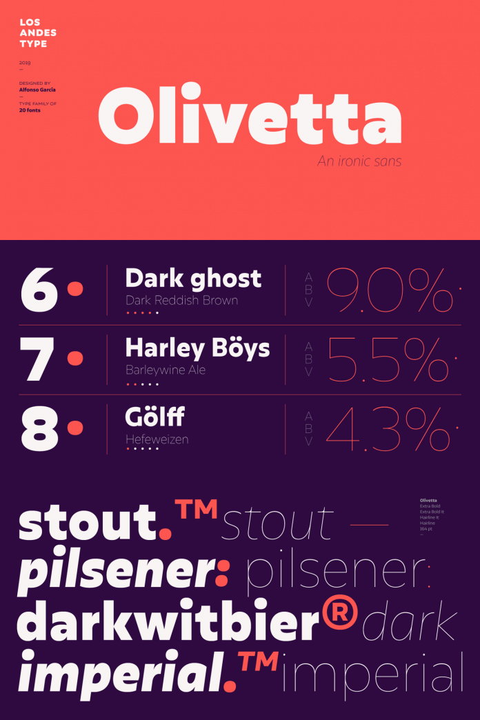
Another top-quality font for social media, Olivetta is a popular font among designers. Comes with a very clear design, it belongs to sans family.
The Olivetta font looks very attractive on any color background. It can be a great font for Instagram posts, banners, social media advertisements to promote your product.
Final Word
Pairing your content with the right font to establish complementarity is a knack that one needs to perfect if they’re aiming at retaining their social media presence.
Don’t forget, fonts are necessary to capture as well as maintain interest in your work!
Social media is largely accepting and experimenting sphere, where you can showcase your quirks and let your imagination run wild.


