HTML and CSS registration form templates are pre-designed code frameworks that simplify the creation of user registration forms for websites and applications. They provide the foundational structure and styling needed for input fields, buttons, and other form elements. Each one typically includes HTML for content and structure and CSS for styling and layout.
These frameworks allow developers and designers to focus on integrating the templates and making minor adjustments to fit their specific project needs instead of starting from scratch. As a result, they can maintain consistency and save valuable time while building functional and visually appealing registration forms.
Awesome, right?
That’s why there are numerous templates available.
But, the downside of this abundance is that many developers and designers struggle to identify the best options for their specific project needs. If that sounds like you, you’re in luck.
This article will review some of the best HTML and CSS registration form templates and discuss everything you need to know about them. It will also discuss their advantages, key elements, customization options, and what to look out for when choosing one.
You’re in for a treat!
However, before we dig in properly, let’s discuss some advantages of using a pre-made template.
Advantages of Using a Pre-Made Template
Website and application developers stand to gain the following by using pre-made HTML and CSS registration form templates.
Time-Saving
Using a pre-made registration form template really cuts down on development. Instead of building a form from scratch, developers can plug in the template and tweak a few things to make it fit their project properly.
Consistency
Using pre-made templates keeps your registration forms looking consistent across your whole website or app. This is super handy if you’ve got a big project with tons of different forms – the templates make sure they all match up nicely.
Professional Design
Many of these templates are created by professional web designers who follow user experience (UX) and user interface (UI) design best practices. This results in forms that not only look great but are also super easy to use.
Built-In Functionality
Templates usually include handy features like form validation, error handling, and responsive design. These tools are super important for making the registration process user-friendly and reducing mistakes.
Ease of Customization
These templates are usually made to be super easy to customize. Developers can switch up colors, fonts, input fields, and other elements to fit their project’s branding and needs.
Top Responsive Registration Form Templates You Can Use
The following are some of the top responsive registration form templates offering the advantages listed above.
Material Design Sign-Up Form
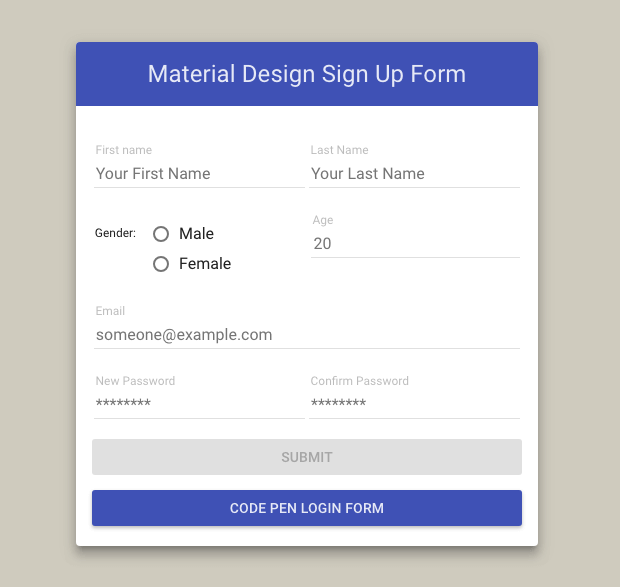
This sleek and simple registration form uses material design to make signing up a breeze. It’s quick and to the point, so your users won’t have to deal with a bunch of fields.
You’ll find all the essential information you need, like gender, age, name, and email, which means you can gather important details to surprise your customers with special gifts on their birthdays. This template is perfect for anyone looking to create a user-friendly registration experience without overwhelming their users.
Pupassure
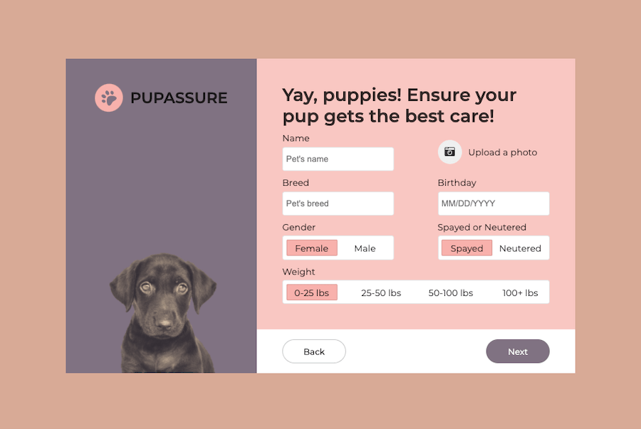
This handy registration form CSS template is perfect for your social media site or any platform that needs basic user info. The template comes with easy-to-edit CSS code that allows you to make all the changes you need and add them to your site. It can capture all the essential details like name, profile image, gender, and more.
While it’s designed with pet-related information in mind, you can easily tweak it to fit any community site you choose.
The best part?
The CSS code is super easy to edit, so you can make all the changes you need to get it just right for your site.
Simple Registration Form
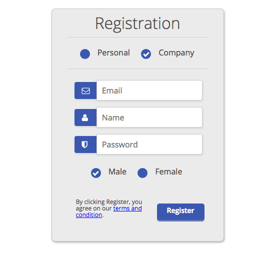
This clean and simple registration form has just a few important fields, and you can easily tweak it to fit your needs. It’s perfect for any business site, letting users sign up as either a company or an individual to access your services.
The simple registration form works great if you’re running a community site for professionals where your platform helps connect companies with freelance pros. It keeps things straightforward while still gathering all the essential info you need!
Multi-Step Form with Progress Bar using jQuery and CSS3
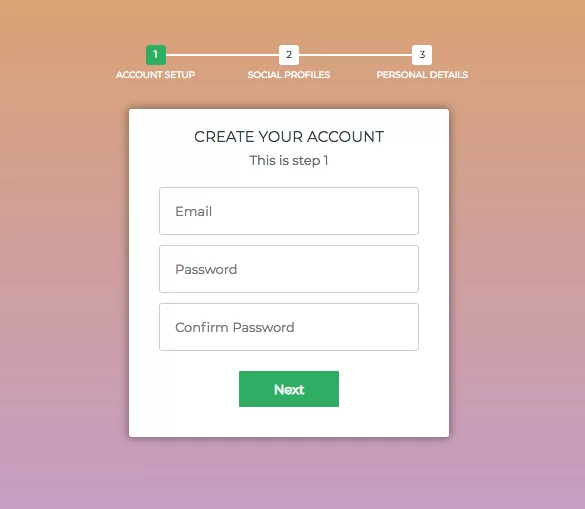
Breaking up a long registration form is a great way to prevent your users from getting frustrated.
Some businesses need specific details from users, and this template makes it easy to collect that info without overwhelming them. It’s designed to capture all the important details you need but in a way that feels manageable for the user.
Whether you’re looking to gather basic info or more specific data, this form helps you get what you need while keeping the experience smooth and user-friendly.
Creative SignUp Form
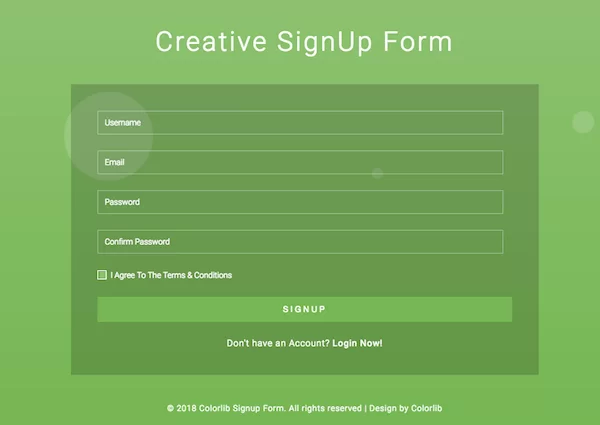
This creative registration form has a transparent design that really pops against a colorful background. It also has some awesome background animations that make it stand out even more.
As such, it is perfect for grabbing attention on your site while collecting user info. Likewise, It’s great for events or promotions where you want to create a fun and engaging sign-up experience. Finally, the eye-catching design helps keep users interested as they fill out their details!
Pokemon Style Signup form

This sweet Pokemon-inspired registration form has a totally creative and fun design coupled with a slick operation.
The best part is the awesome animation when you first load it up. It takes a few seconds to kick in, but once it does, you’re left with this awesome form that just pops.
The animation makes the form appear really cool. This template is perfect if you want to grab people’s attention and get them excited to sign up. The Pokemon theme is great for anything gaming or anime-related, but you could tweak the design to fit other styles, too.
It’s sure to make a great first impression and get people stoked to join your site or service. If you want a registration form that’s equally functional and fun, this is definitely one to check out!
Cupo Signup
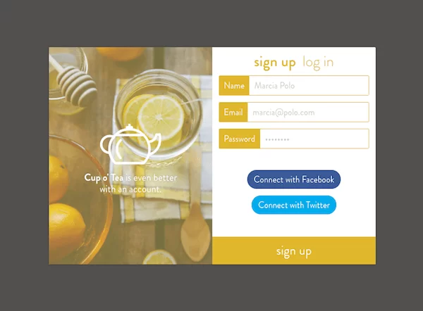
This flashy registration form is a great fit for restaurant-related websites. The design is super easy to tweak, so it can work for any niche site you have in mind.
If you’re running a food business blog, a restaurant site, or anything else in the food industry, this form will come in handy. It captures all the basic user info you need while adding a fun touch that fits perfectly with your theme.
Spectre sign-up form
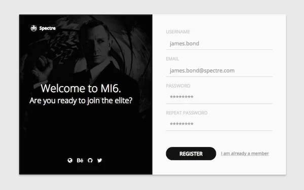
This attractive registration form design features an image on one side and the form on the other, making it visually appealing and functional. You can easily swap out the image for something that fits your business, so it feels like a natural part of your site.
This template is perfect for any business looking to create a seamless sign-up experience. Whether you’re promoting a service or gathering user info, this setup helps grab attention while collecting the necessary details. It’s a great way to make your registration process stand out!
Free CSS3 Sign Up Form
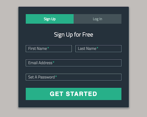
This simple and classic sign-up form features both a login and registration option side by side. The layout makes it super easy for users to pick what they need and get started right away.
It’s a great choice if you want to keep things straightforward while still giving users a quick way to sign up or log in. Whether you’re building a community site or need a reliable way for users to access your services, this form has you covered!
Student Registration Form
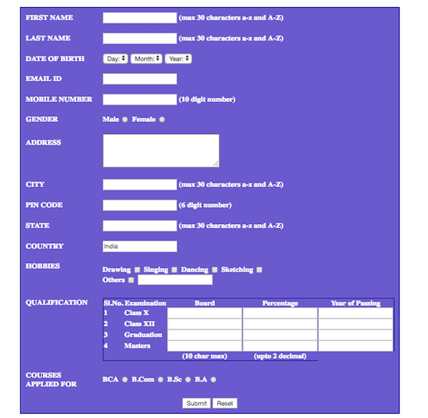
Sometimes, you need to gather important information from users, such as their name, gender, mobile number, and address. If you’re running a business that requires this kind of data, this form is just what you need.
It’s designed to make it easy to collect all those details without overwhelming your users.
Bootstrap Registration Form

The Bootstrap Registration Form is a professional-looking registration form perfect for anyone looking to create a polished sign-up experience. Whether you’re collecting user info for a service or just need a clean way for people to register, this form has you covered. Plus, with its flexible design, you can make it match your brand in no time!
While the options we’ve highlighted above are top choices for most websites and applications, you may come across more awesome templates out there.
So, to help you recognize an effective choice, we’ll discuss some elements to look out for in the next section. The choices above contain these elements.
Elements of an Effective Registration Form
An effective registration form should feature all or a combination of most of the following elements:
1. Clear Labels and Instructions
Each input field should have a clear label, and any necessary instructions should be provided to guide the user through the registration process. This helps reduce confusion and ensures that users provide the correct information.
2. Simple and Intuitive Layout
The form layout should be simple and intuitive, guiding the user through the process step-by-step. A clean and organized design reduces cognitive load and makes the form easier to complete.
3. Minimal Required Fields
Asking for too much information can frustrate a user and ultimately lead to form abandonment. So, an effective registration requests only essential information from the user.
Optional fields can be included but should be clearly marked as such.
4. Responsive Design
An effective registration form must be responsive, meaning it should work well on various devices and screen sizes. This ensures a good user experience regardless of whether the form is accessed on a desktop, tablet, or smartphone.
5. Validation and Error Messages
Real-time validation and clear error messages help users correct mistakes as they fill out the form. This reduces frustration and increases the likelihood of successful form submission.
6. Security Features
Incorporating security measures, such as CAPTCHA, to prevent automated spam submissions and SSL encryption to protect user data is crucial for an effective registration form.
7. Submit and Reset Buttons
Providing a clear “Submit” button and, optionally, a “Reset” button to clear the form helps users understand how to complete the registration process. The buttons should be prominently placed and labeled.
With these elements in mind, you can confidently choose the right registration form template for your needs using the guides in the following section.
How to Choose the Right Registration Form Template for Your Needs
This guide will help you navigate the selection process by highlighting key factors to consider, distinguishing between simple and complex forms, and emphasizing the importance of responsiveness and compatibility.
Factors to Consider in a Template
- Purpose and Functionality: Determine what type of information you need to collect and the purpose of the form.
- Ease of Customization: Look for templates that allow easy adjustments to fit your branding and specific needs.
- Design and Aesthetics: Choose a template with a professional and appealing design that aligns with your overall website or application style.
- User Experience: Ensure the form is intuitive and user-friendly, with clear instructions and minimal required fields.
- Validation and Security: Check for built-in validation features and security measures to protect user data and prevent spam.
- Compatibility: Verify that the template works seamlessly across different browsers and devices.
Differentiating Between Simple and Complex Forms
Simple forms typically contain only the most essential fields, such as name, email address, and password. They are ideal for quick sign-ups and reducing user friction. Complex forms, on the other hand, may include multiple sections and a wider range of fields, such as address, phone number, and additional preferences or questions.
These are suitable for more detailed data collection, such as event registrations or membership sign-ups. When choosing between simple and complex forms, consider the balance between gathering necessary information and maintaining a streamlined user experience. Overly complex forms can deter users, while overly simple forms might not capture all the required data.
Ensuring Responsiveness and Compatibility
A responsive template ensures that the form adjusts and functions smoothly on desktops, tablets, and smartphones, providing a consistent experience regardless of the user’s device.
Compatibility across different browsers is equally important to ensure that all users can access and complete the form without encountering issues.
Before finalizing a template, test it on multiple devices and browsers to confirm that it performs well and meets your usability standards.
Conclusion
Choosing the right HTML and CSS registration form template can make all the difference in creating a smooth and enjoyable user experience.
With so many great options out there, you can find one that not only fits your project needs but also captures user attention. Whether you’re looking for something simple, flashy, or tailored for a specific industry, these templates offer the flexibility and functionality you need to get users signed up quickly and easily.
So go ahead, pick a template that resonates with your brand, and start building those connections!


