
Every design, whether it’s the app, the website, or any digital product should be user-centered. It should be easy to understand and navigate, as well as be quick, reliable, and accessible to the broadest category of customers. The principles haven’t changed much since the Nielsen Norman Group formed the 10 Usability Heuristics for User Interface Design in 1994 (updated in 2020).
These usability principles include consistency throughout the whole design, flexibility, efficiency of use, error prevention rules, user controls, and freedom. Every time one or a few of them are missing, users feel that. In order to avoid usability mistakes and minimize the user’s discomfort, it’s important to conduct a UI Audit from time to time (if you don’t have complaints) and each time you see a decline in customer analytics.
Step 1: Website Walkthrough
The website walkthrough is the easiest and the most “formal” stage of the user interface (UI) audit. Here, you want to look at the website from the user’s point of view and check that all its features function correctly. Ideally, it should be a systematic activity, aiming to identify possible issues and opportunities for improvements.
Some of the things that are checked during the walkthrough include:
- Loading speed — how quickly the pages load (the standard is up to 3 seconds);
- Navigation — whether it’s easy to find the menu and navigate on the website;
- Interactive elements — if all the buttons, forms, and links work properly, etc.
The usability of the website’s interface can make or break the user experience of your services and really harm your online presence. Regular walkthroughs will make sure your website is operating at its peak.
Step 2: User Experience Check
A website’s UX can be difficult to quantify. During the UX assessment, you basically have to check if your website is user-friendly and intuitive enough so that it doesn’t confuse the user but helps them achieve their goals on the website. The best way to investigate this is to collect user’s feedback to get unbiased reviews.
Otherwise, you have to evaluate the following things:
- Is the service or product you offer positioned clearly, and do the customers know what
they can get out of the website? - Is it possible to find the required information on the website?
- Can users navigate the website without confusion?
- Is it easy to contact you or the Help Center if needed?
If you can answer affirmatively to these four questions, you already have the basic criteria for a positive user website journey.
Step 3: Speed Evaluation
The most cited research made by Google claims that the page loading speed should be up to 3 seconds. With each new second, the bounce rate increases, meaning that people are more likely to leave your website if it isn’t loading fast enough. It also affects the ranking of the search results page and the overall user experience. Measuring the page speed is easy with the majority of online tools. PageSpeed Insights by Google will tell you all the essential info about a page — both the desktop and mobile versions.
GTmetrix is another free tool that provides performance and speed insights and suggests areas for improvement.

Some of the things you can do to increase the loading speed include optimizing images or compressing them; enabling browser caching, so the content won’t load for the user repeatedly; reducing server response time; utilizing Content Delivery Network (CDN) to host your website’s content on different servers around the world.
Step 4: Clarity Test
Clarity is another important requirement for a good UX design. It usually means two things: easy navigation and content understanding. The harder it is to navigate the website and understand what it’s about, the larger the bounce rate you will get. This leads to a lower conversion rate since the users leave the website without doing the target action.
There are some common errors the website owners make that lower the clarity:
- Confusing navigation that makes it difficult for the user to find the needed section;
- Redundancy of content that can “hide” the most important message;
- Excessive visual elements that clutter the design and distracting the user;
- Unclear or industry-specific wording that an average user won’t understand.
Strive for simplicity in order to make the website more enticing. This way, you’ll make it easy for
the user to achieve the goal — whether it’s buy/read/order/subscribe, etc.
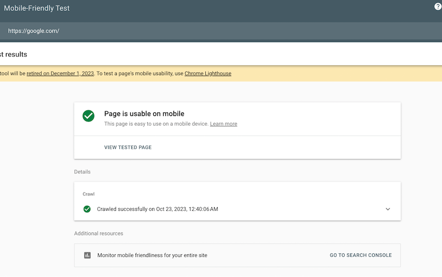
Step 5: Mobile-Friendly Check
Most websites nowadays are created using the mobile-first approach, which makes a lot of sense, since most global users (95.3%) access the Internet using smartphones and only 64.3% use laptops. That’s why all the websites should be optimized for phones and tablets.
Google has a specific mobile-friendliness tool that allows you to check your website for free. PageSpeed Insights can help here as well, providing more detailed feedback. You can also use emulators that can show you how the website appears on different screens. Such tools can also suggest ideas for making the page more responsive, like optimizing images and menus, prioritizing important content, etc.
The Final Touch: Transforming Your Website
After the lengthy audit, you finally have the areas for improvement and transforming your website. Implement the changes and sustain them.
Implement
The most common issues you could find in the audit can be solved using a few steps:
- Optimize the page content and use CDNs and caching to make the website load faster.
- Remove the redundant content and unclear messages to make the page more
accessible and straightforward. - Make sure all the interactive elements do what they are supposed to.
- Use a mobile-first approach if you want to implement new features and design changes.
- Simplify the navigation within the website.
These few tips will elevate the UX of your website and decrease the bounce rate without having to completely rebuild it.
Sustain
Keep an eye out for the new digital tools and trends to stay ahead of the competition. Update your website with new content and useful features. Use users’ feedback to determine the new areas for improvement. Don’t forget to visit your website once in a while to do a proper walkthrough to put yourself in the customer’s shoes. It will be worth it in the long run and save you time and money.
In Conclusion
Website improvement is a continual process. It needs constant updates and changes to maintain good UX and achieve smooth interaction. Check your website’s speed, mobile- friendliness, clarity, and accessibility periodically to ensure it’s working at its peak and doesn’t discourage customers from using your services.